

Maisonovo — Rebranding Proposals
Three brand directions for a home goods company ready to connect with a new generation — without compromising on who they are.
Brand Strategy
✳︎
Art Direction
✳︎
Visual Identity
✳︎
Concept Development
✳︎
Brand Strategy ✳︎ Art Direction ✳︎ Visual Identity ✳︎ Concept Development ✳︎
Overview
Maisonovo had built something real: a women-led home goods brand with a clear purpose and a loyal customer base. The challenge wasn't starting over — it was evolving. This project explores three distinct rebranding directions, each designed to attract a younger, design-conscious audience while keeping the brand's sustainable identity intact.
The Challenge
Maisonovo's existing brand wasn't broken — but it wasn't speaking to the new generation of buyers it needed to reach. Millennials aged 28–38, inspired by Gen Z aesthetics, were looking for brands that were cool with a cause: sustainable without feeling preachy, premium without feeling cold, and visually exciting enough to live on their countertops and in their Instagram grids. The brief: evolve boldly, without losing the essence.

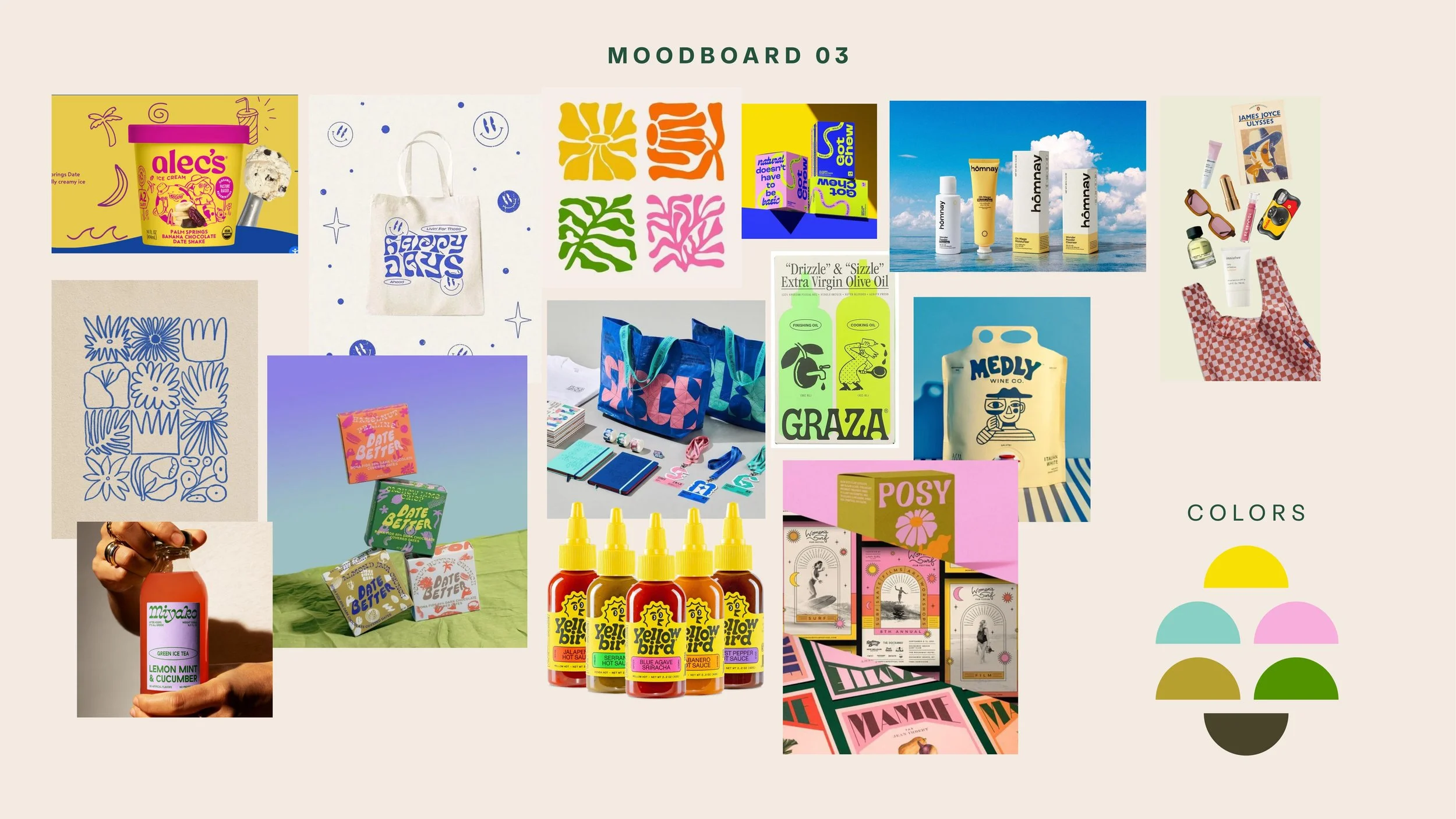
Research
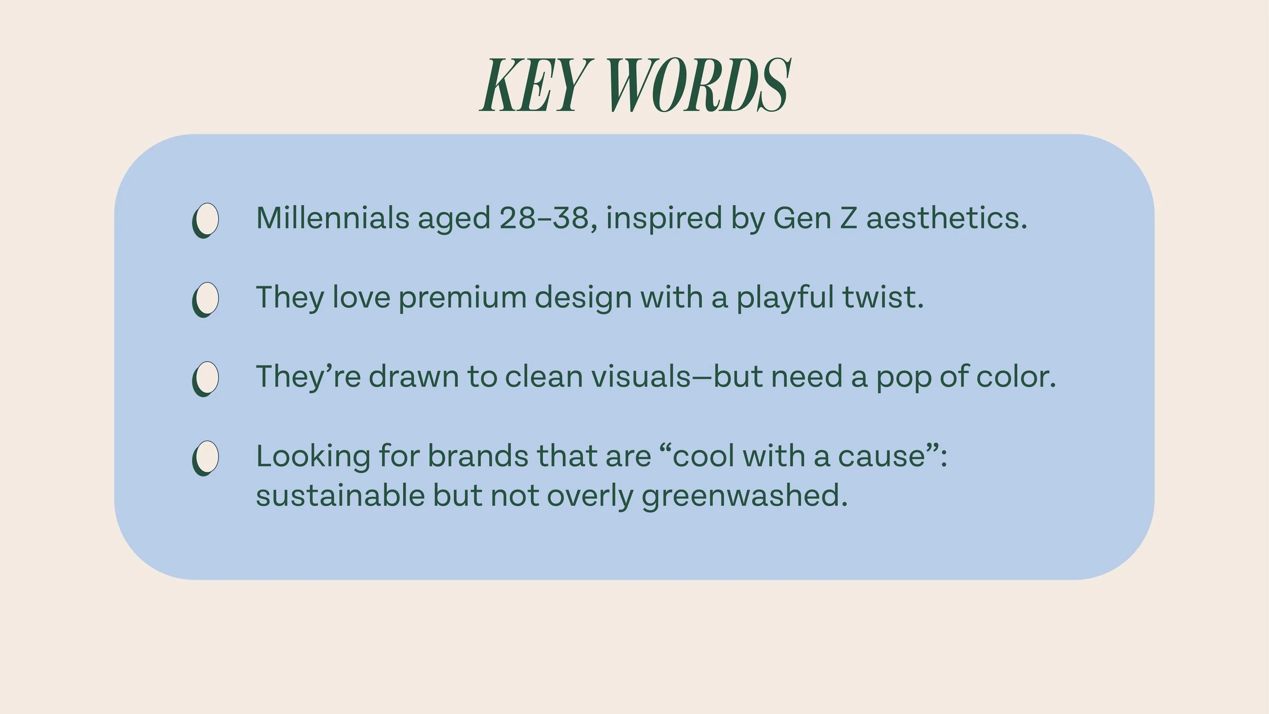
Before touching any visual, the work started with the people. Three distinct buyer archetypes shaped every design decision:
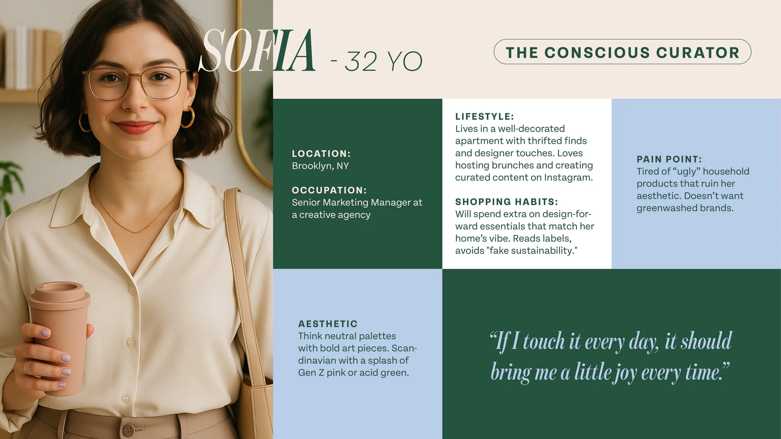
Sofia — The Conscious Curator. She lives in a carefully decorated apartment and spends extra on essentials that match her home's aesthetic. She reads labels and avoids greenwashing. Her quote: "If I touch it every day, it should bring me a little joy every time."
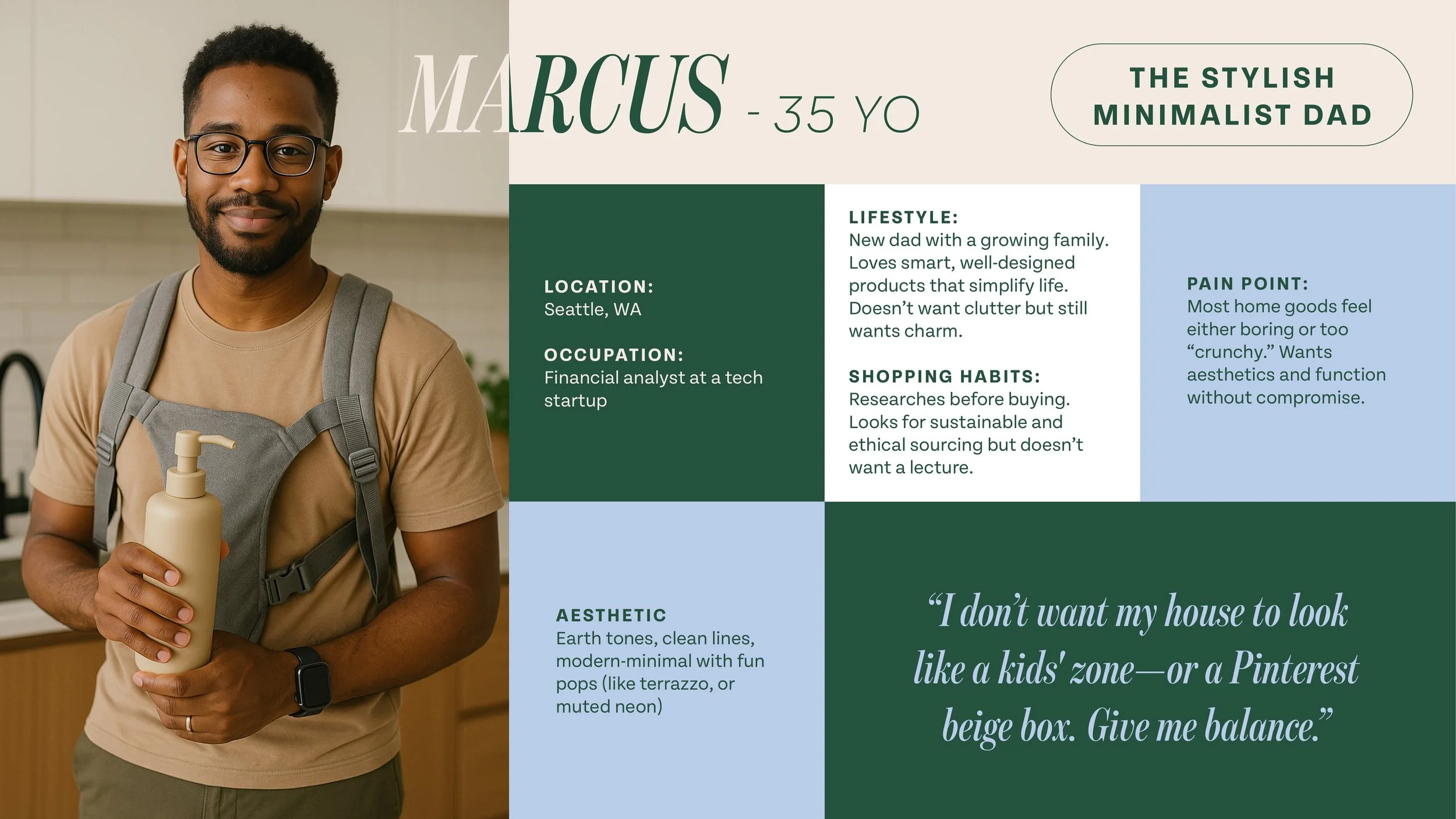
Marcus — The Stylish Minimalist Dad. He wants smart, well-designed products that simplify life without adding clutter. Aesthetics and function, without compromise. His quote: "I don't want my house to look like a kids' zone — or a Pinterest beige box. Give me balance."
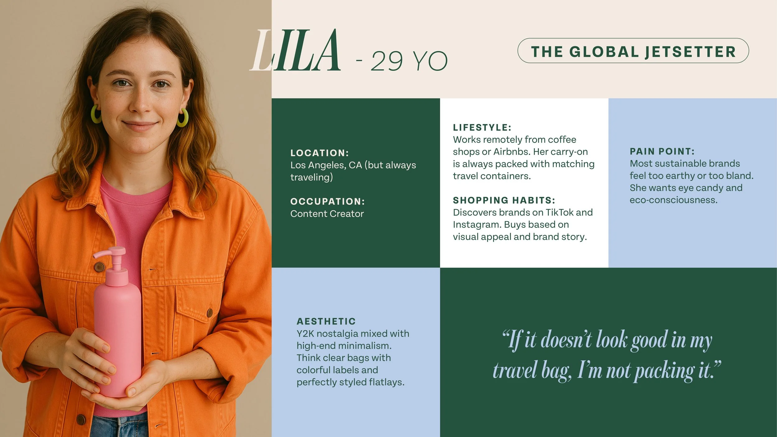
Lila — The Global Jetsetter. A content creator who discovers brands on TikTok and buys based on visual appeal and brand story. Her quote: "If it doesn't look good in my travel bag, I'm not packing it."
Who We Were Designing For
Brand Strategy
The strategy was clear from the start: preserve what makes Maisonovo Maisonovo — its sustainable purpose, its women-led identity, its functionality — and push everything else forward. Bolder visuals. A more emotional, playful tone of voice. Packaging that feels collectible, display-worthy.
Three directions were developed to explore different ways of getting there.
Direction 1
〰️
Direction 1 〰️
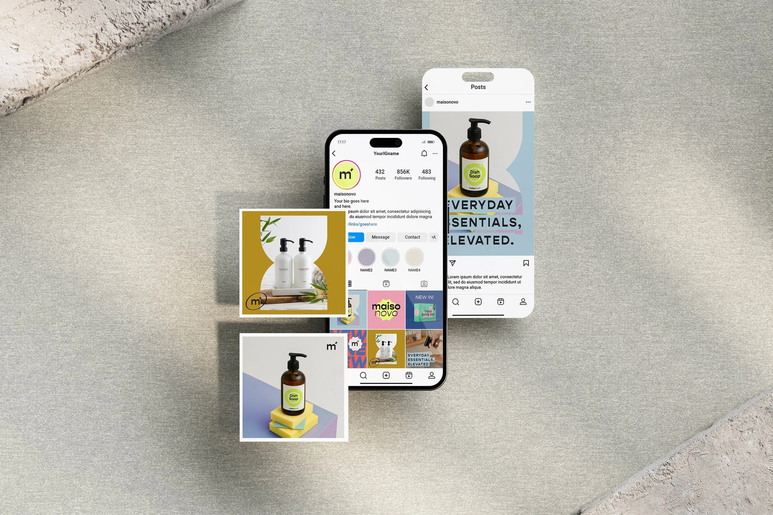
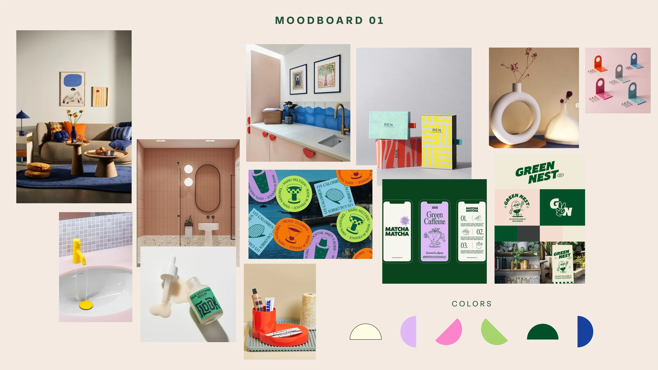
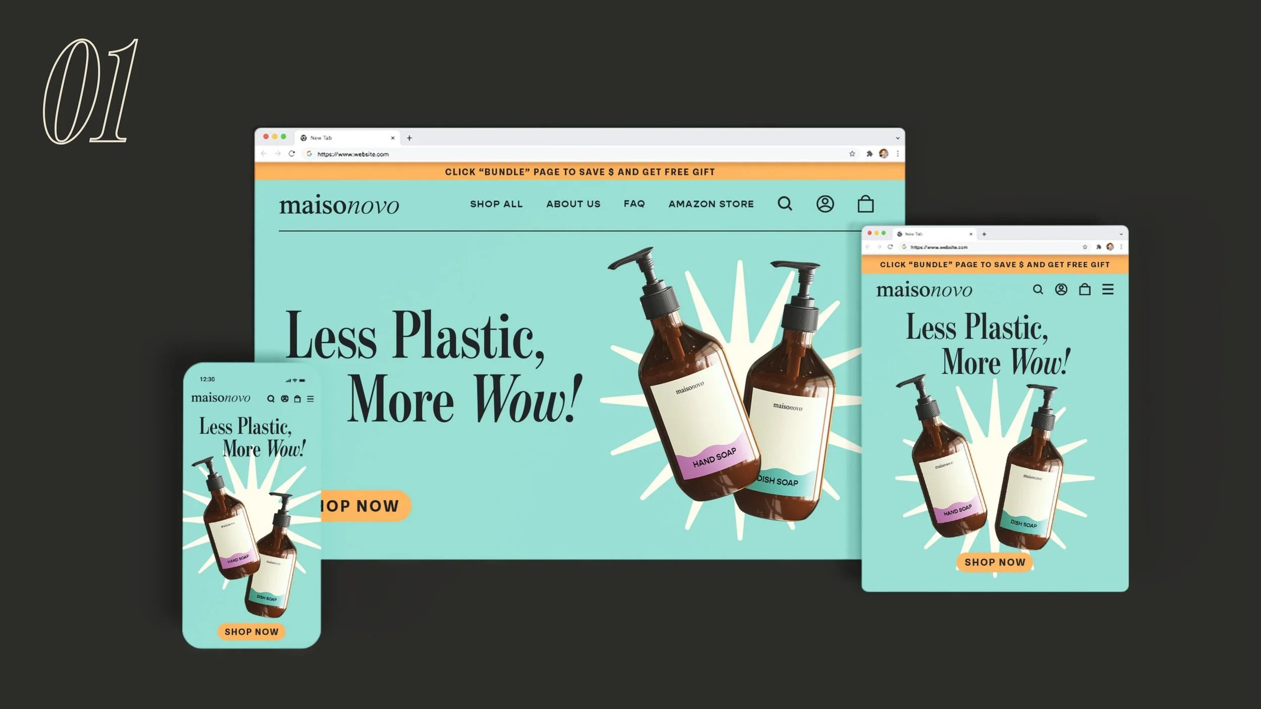
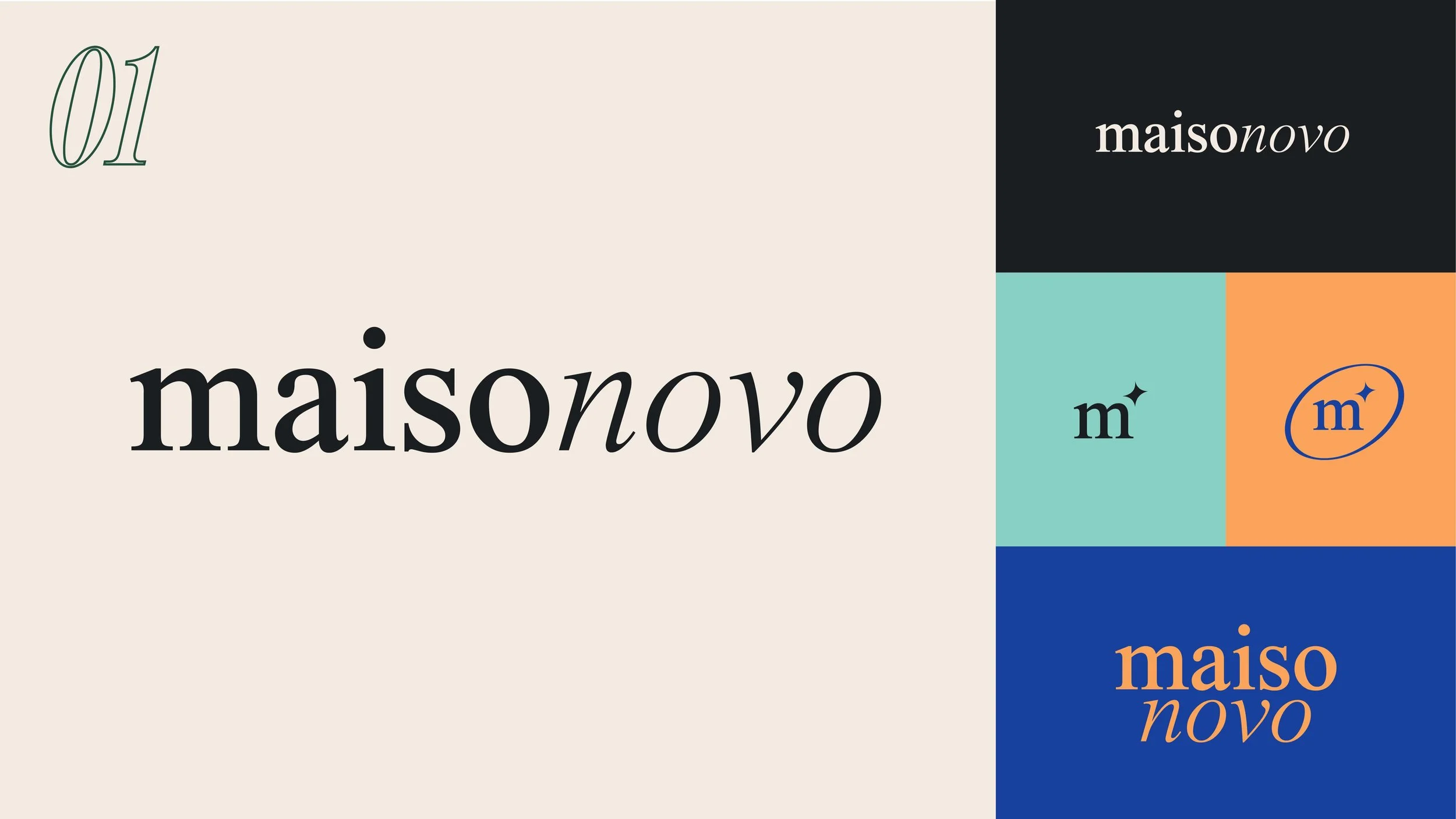
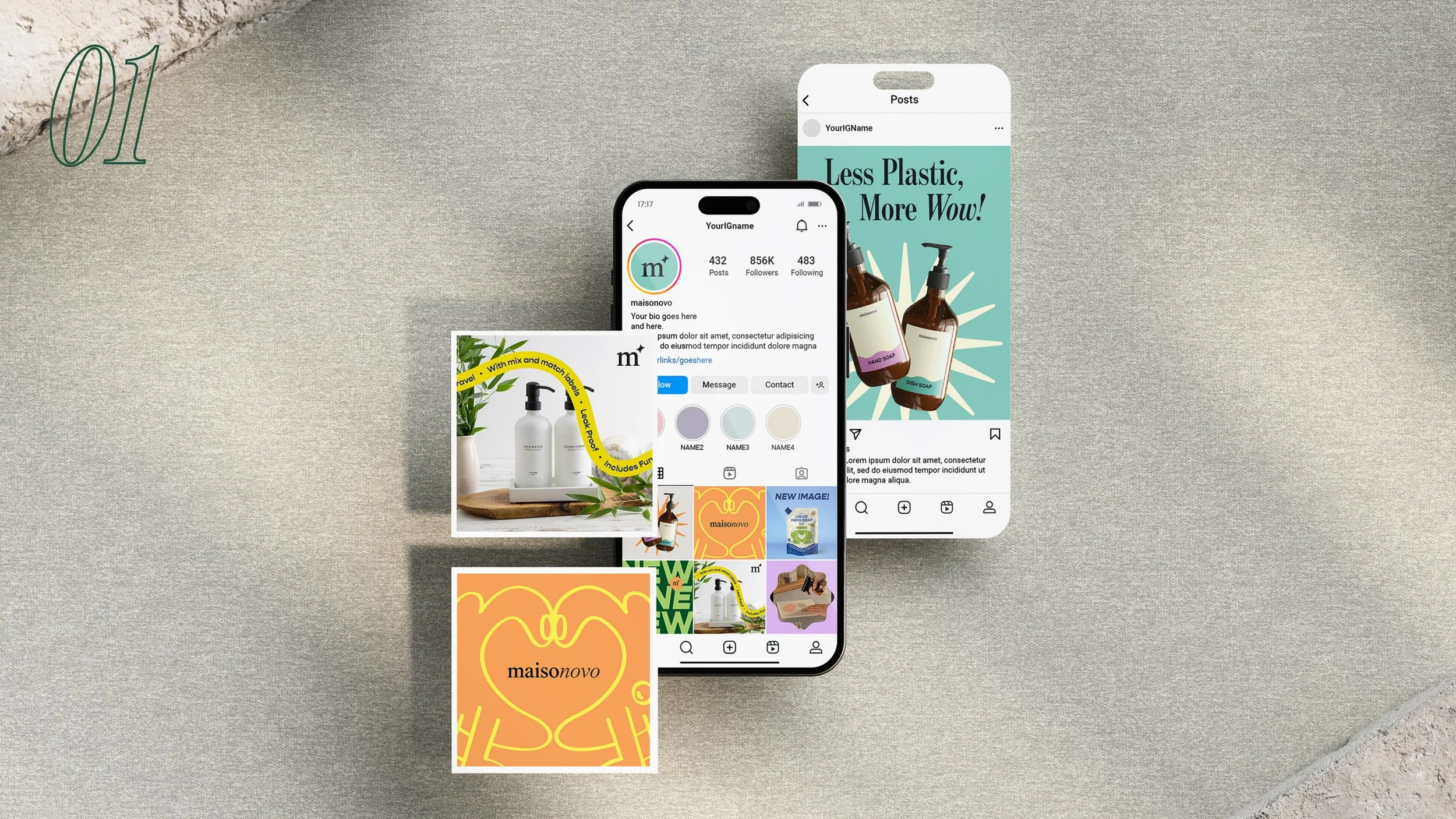
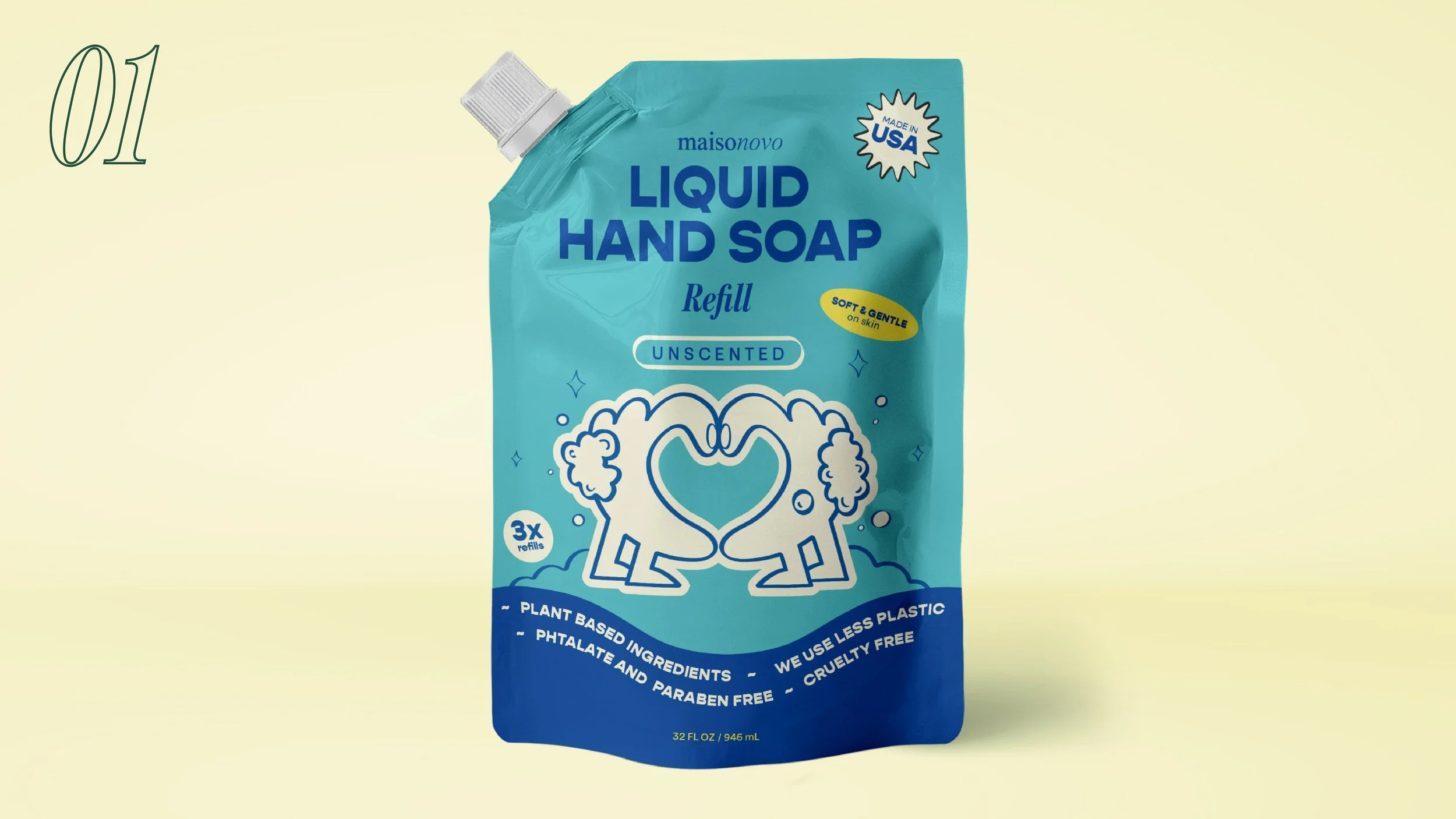
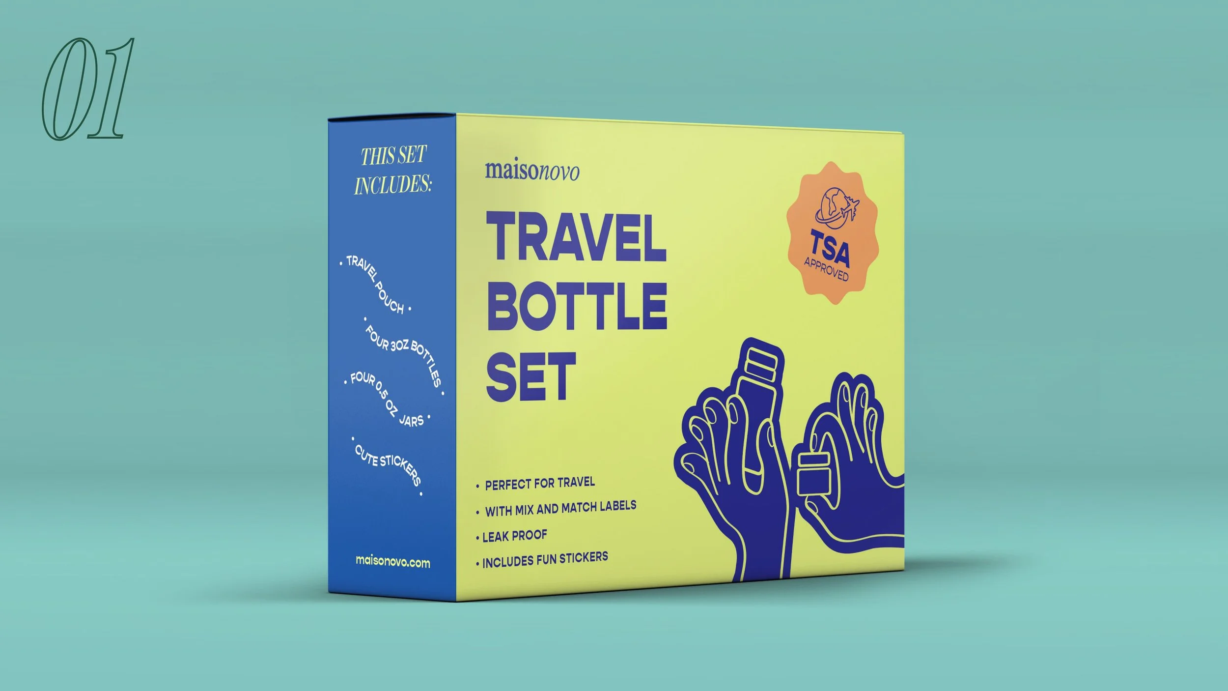
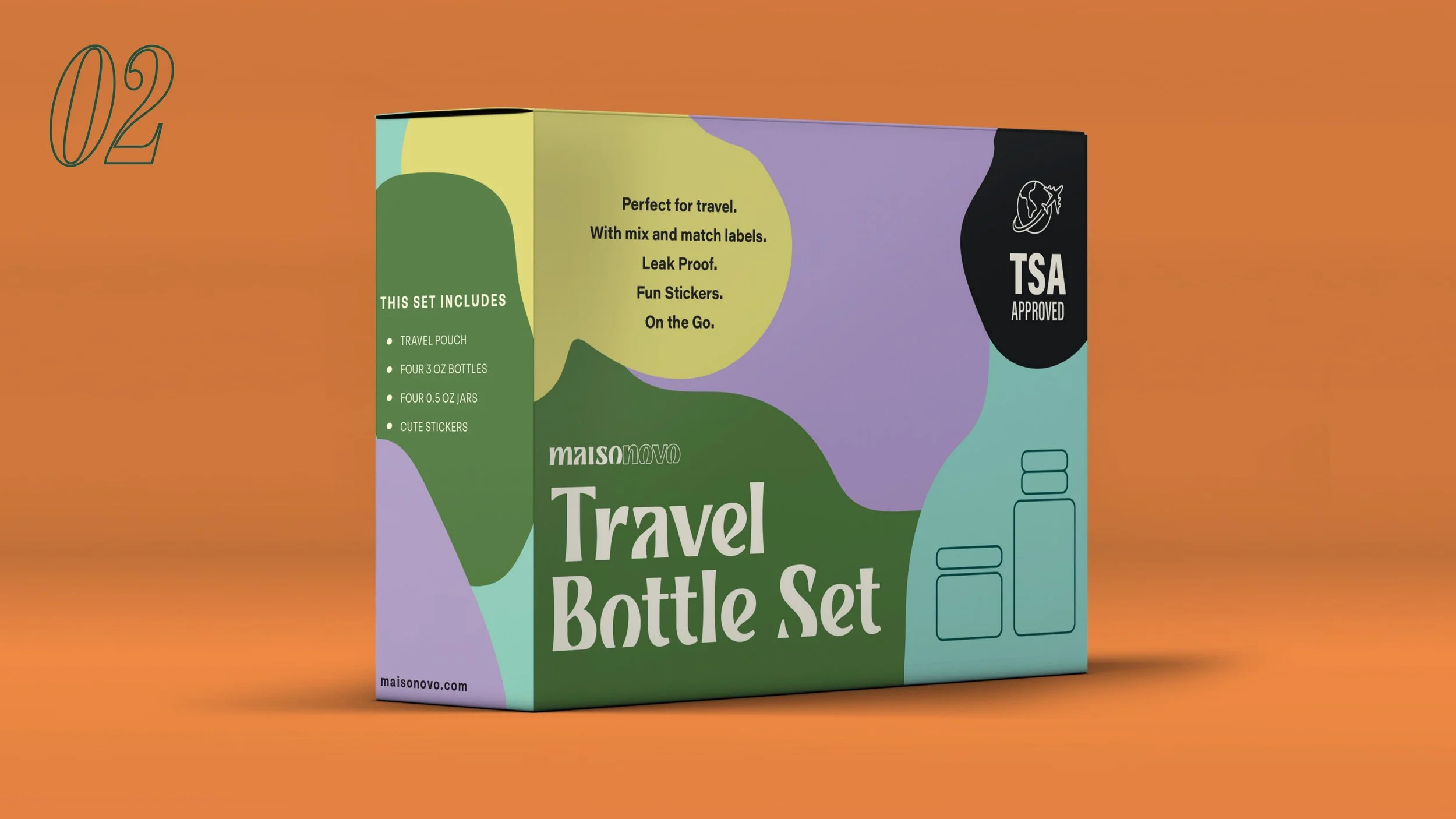
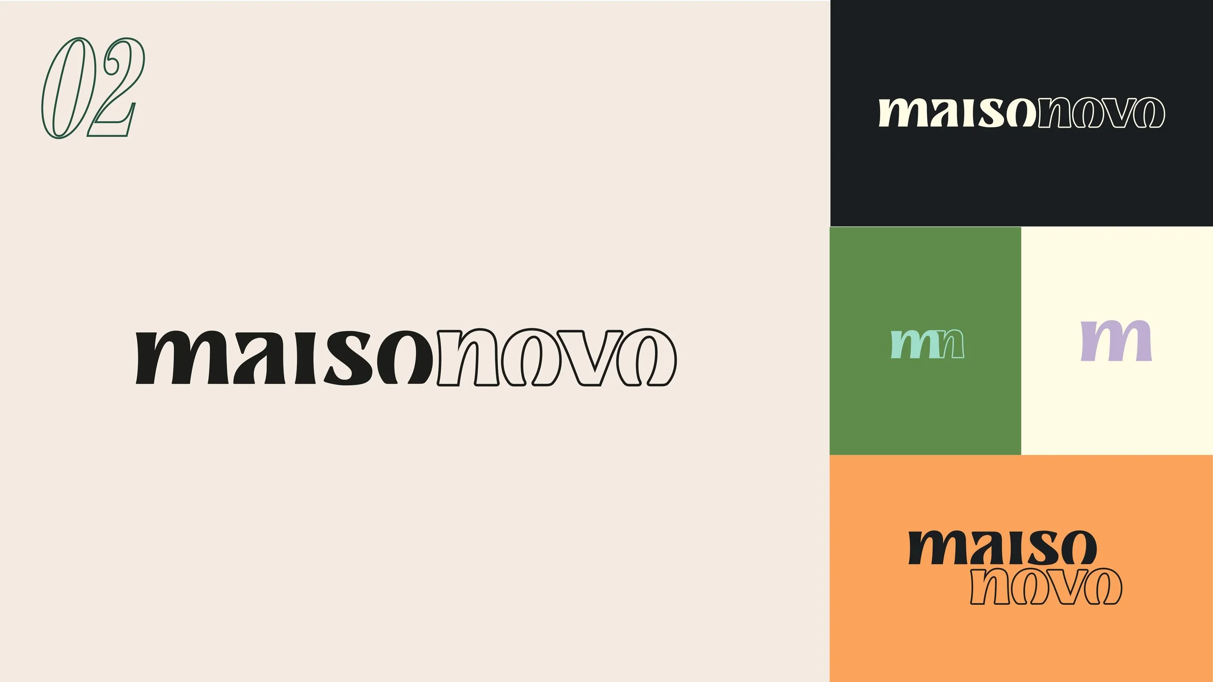
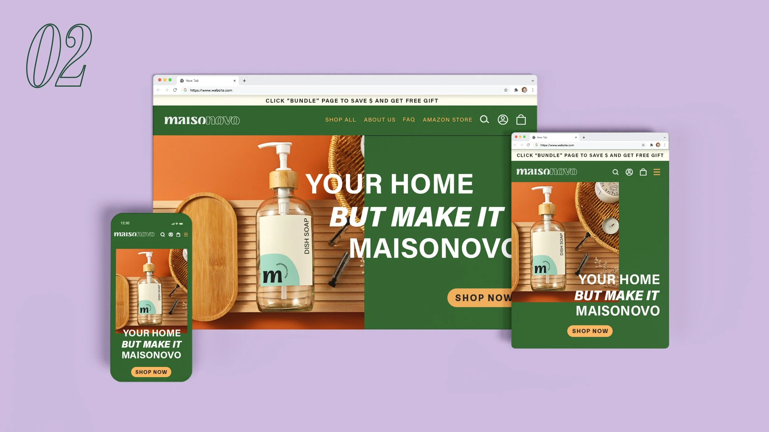
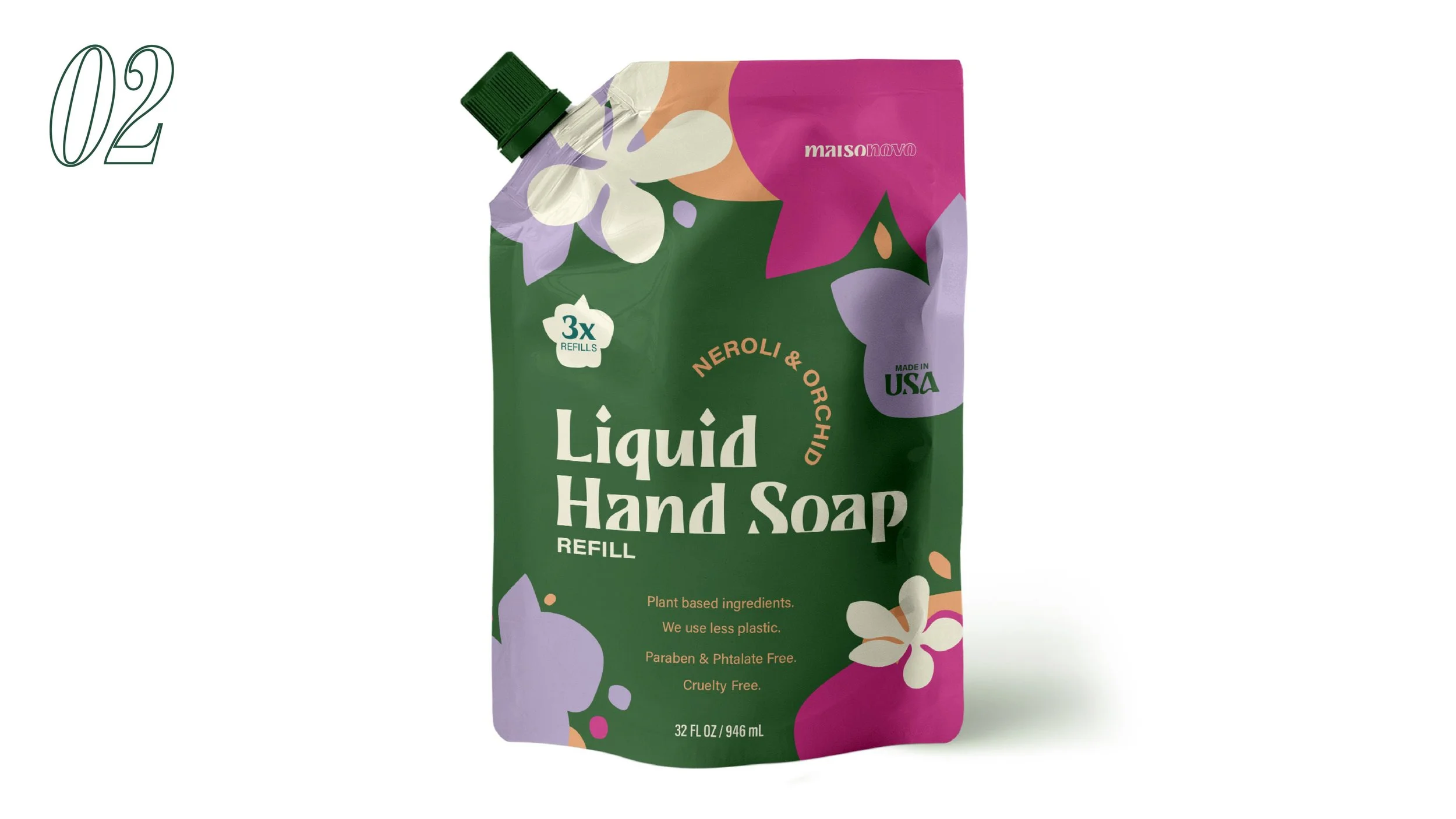
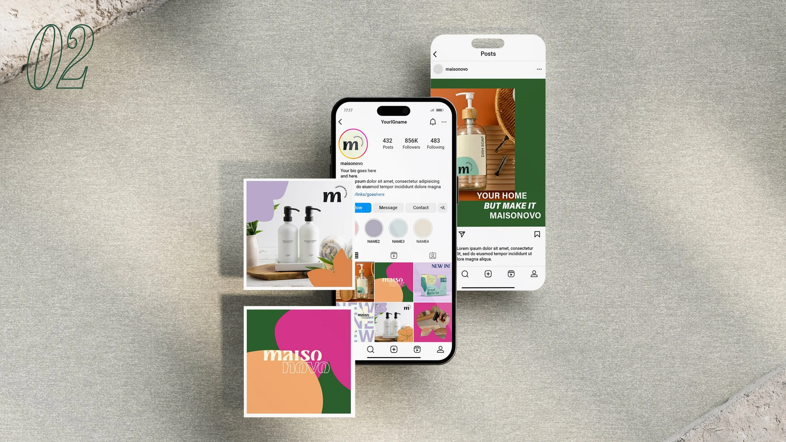
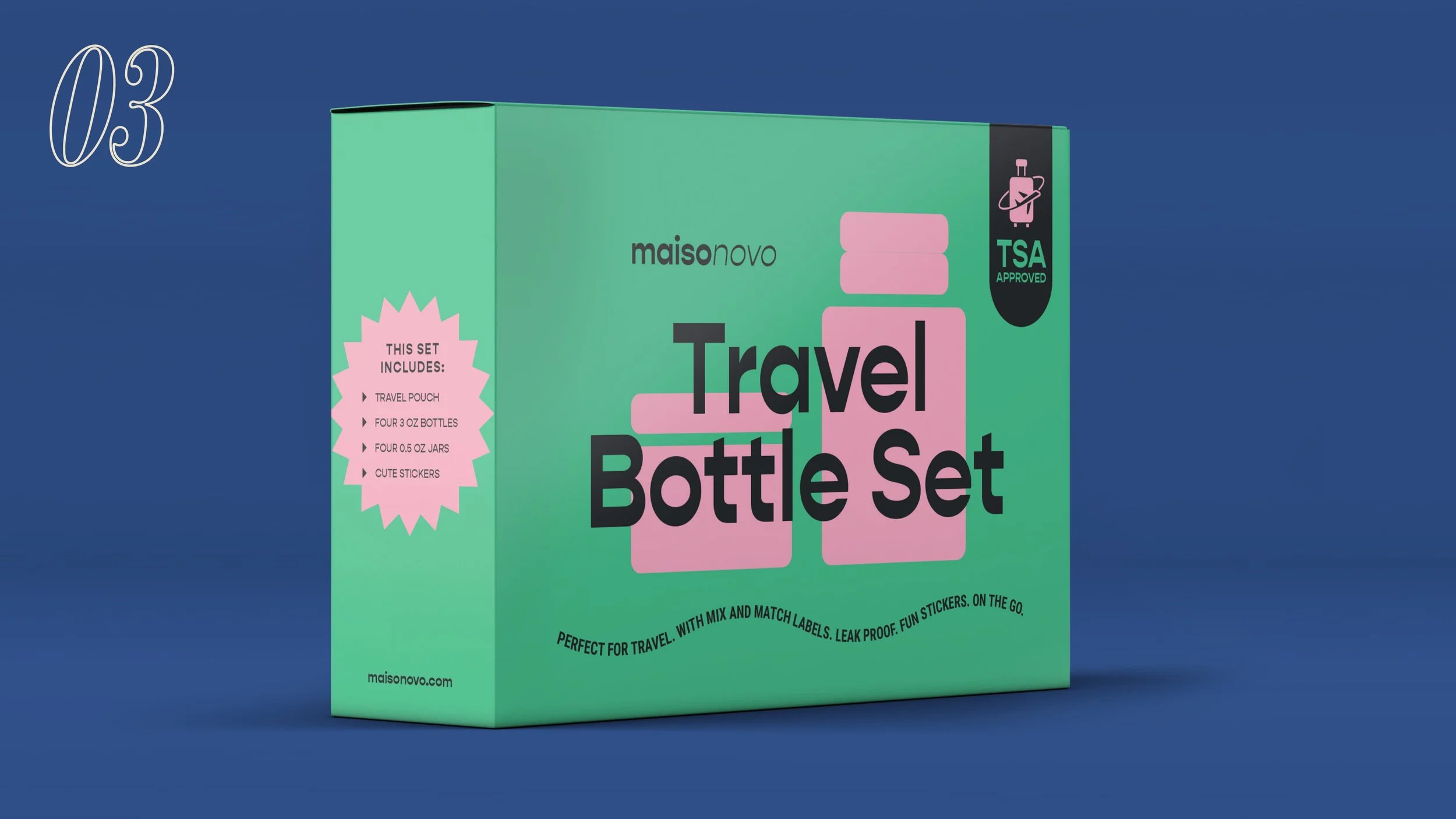
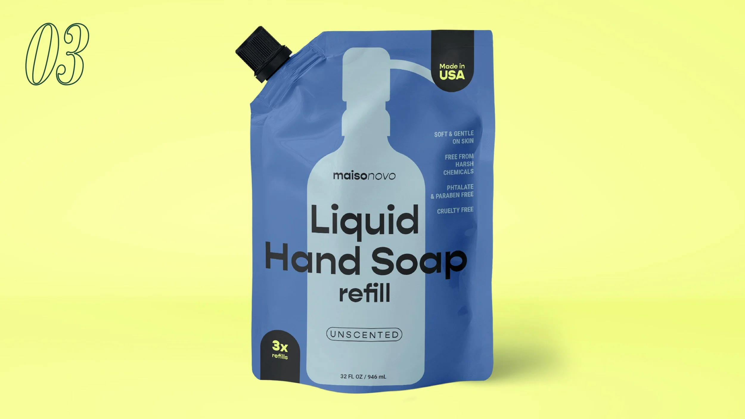
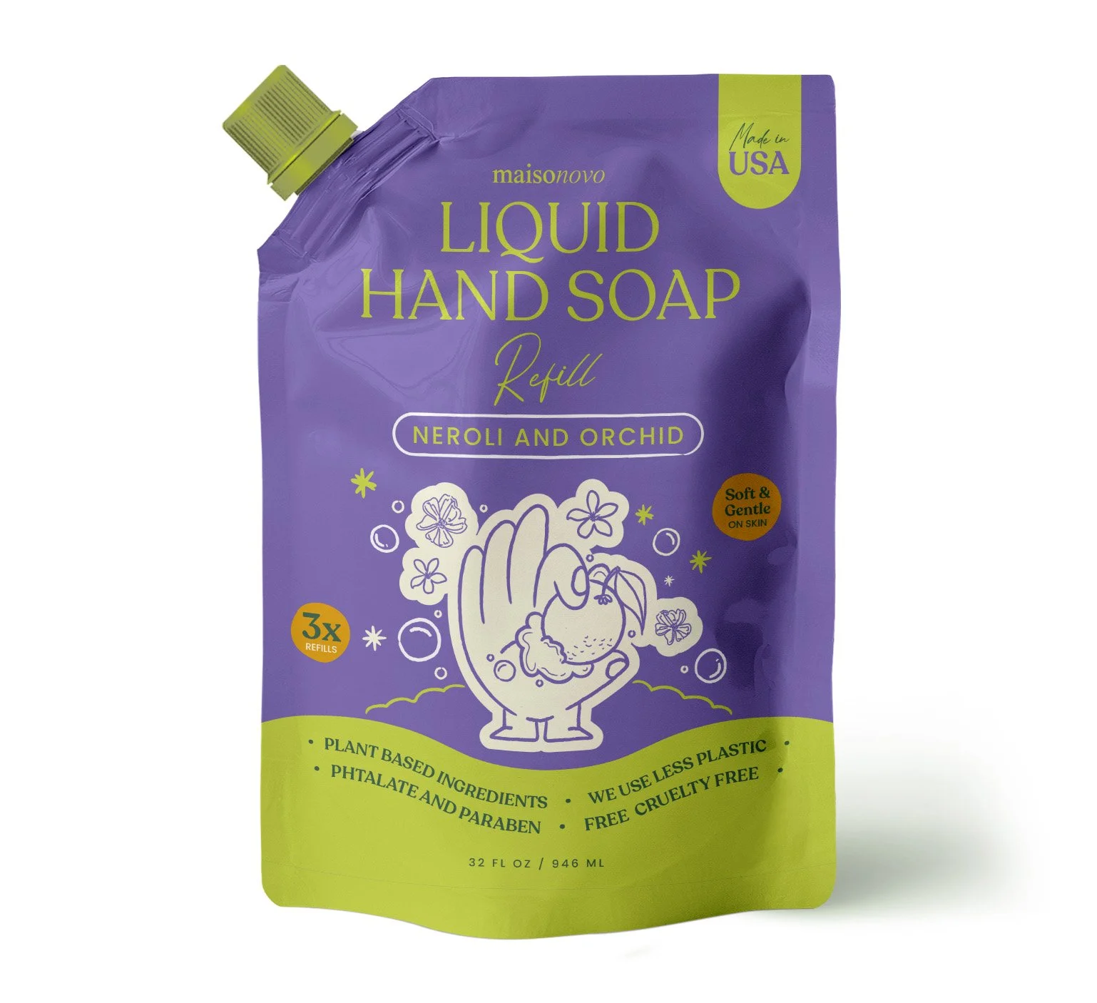
The first direction leans into energy and personality. The logo keeps its serif-italic dual character but gains confidence — paired with a star motif and a palette of mint, orange, cobalt blue, and bright yellow. Typography mixes the elegance of Benton with the playfulness of Gopher. The result is a brand that feels vibrant and collectible — the kind of packaging you'd leave out on purpose.
Applied across e-commerce, packaging (the hand soap refill bag, the travel bottle set), and social media, this direction speaks directly to Sofia and Lila: people who want their household products to look as good as the rest of their carefully curated spaces.
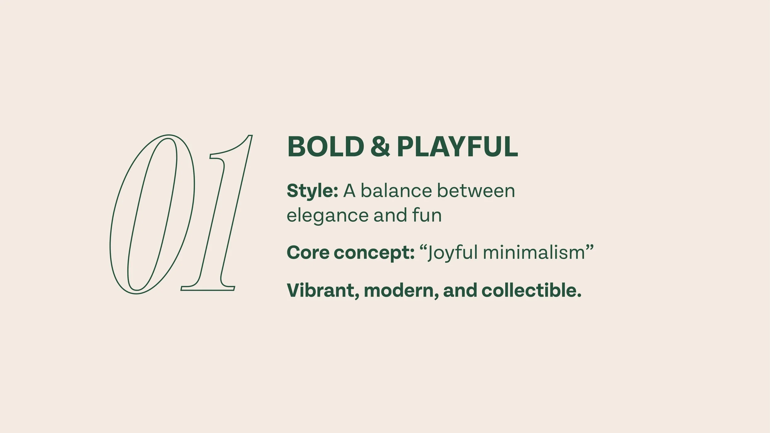
Bold & Playful — Joyful Minimalism
Direction 2
〰️
Direction 2 〰️
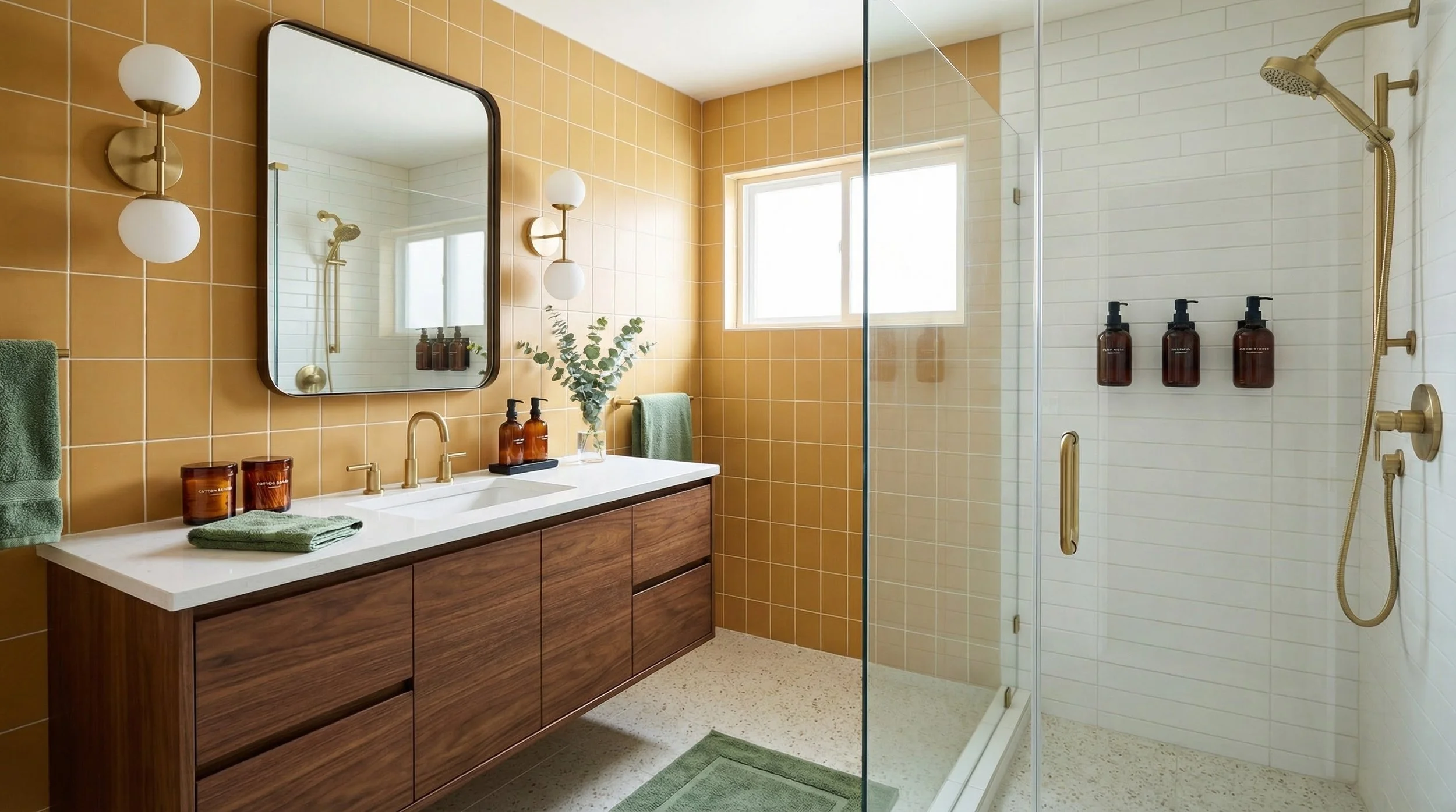
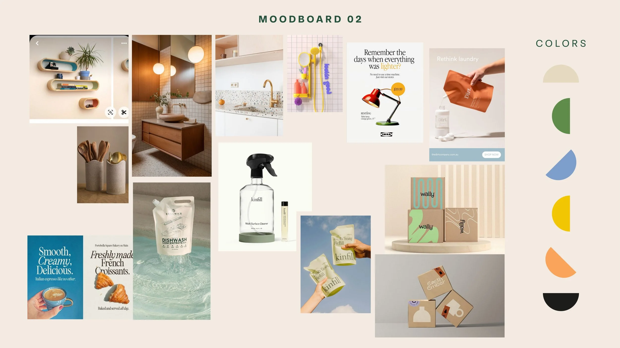
The second direction draws from clean modernism with a nostalgic twist. The logotype shifts to a bold, condensed serif with a distinctive letterform — something that feels like it belongs in a design museum and on a store shelf at the same time. The color palette is quieter: sage green, lavender, off-white, and deep teal, with pops of warm purple and mustard.
This direction hits the sweet spot for Lila and Marcus: people who are drawn to unique, design-forward brands that don't shout but always get noticed. The packaging applications show a brand that can live comfortably between a boutique retail shelf and a TikTok unboxing video.
Retro Modern — Retro Refinement
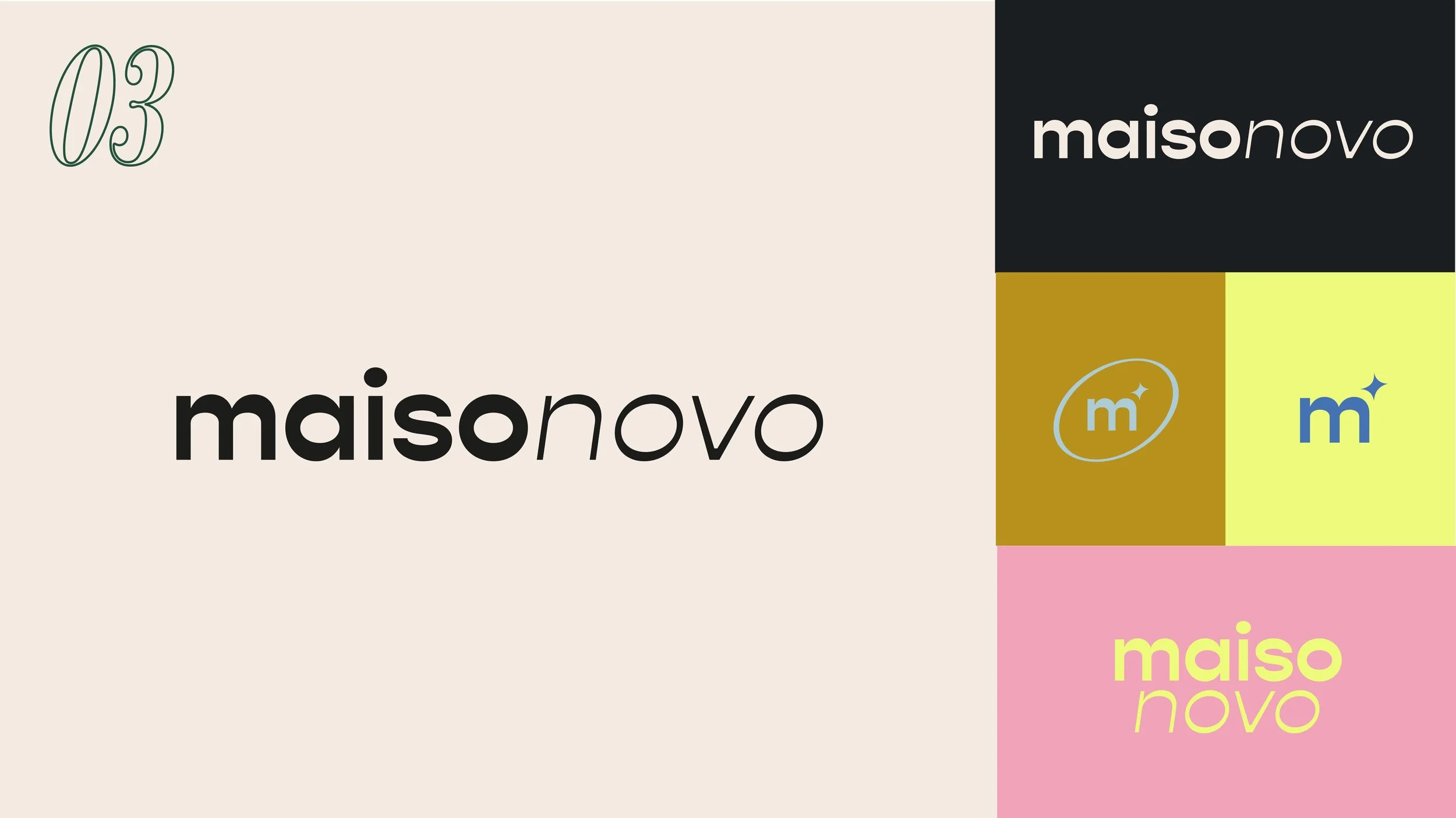
Direction 3
〰️
Direction 3 〰️
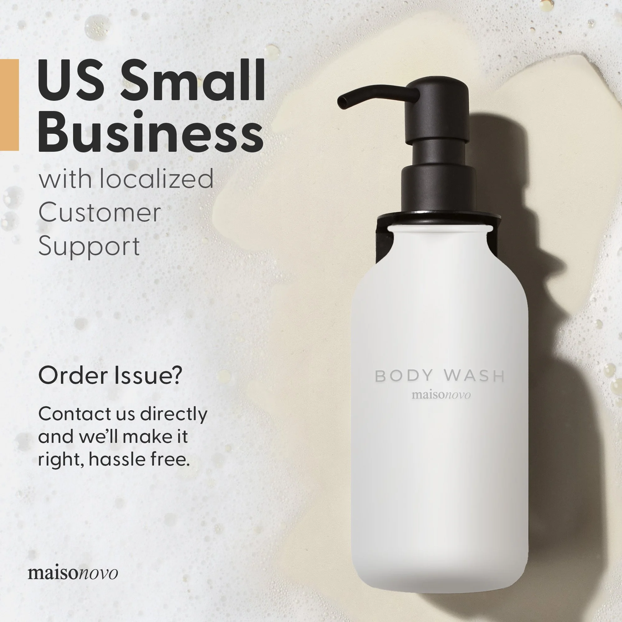
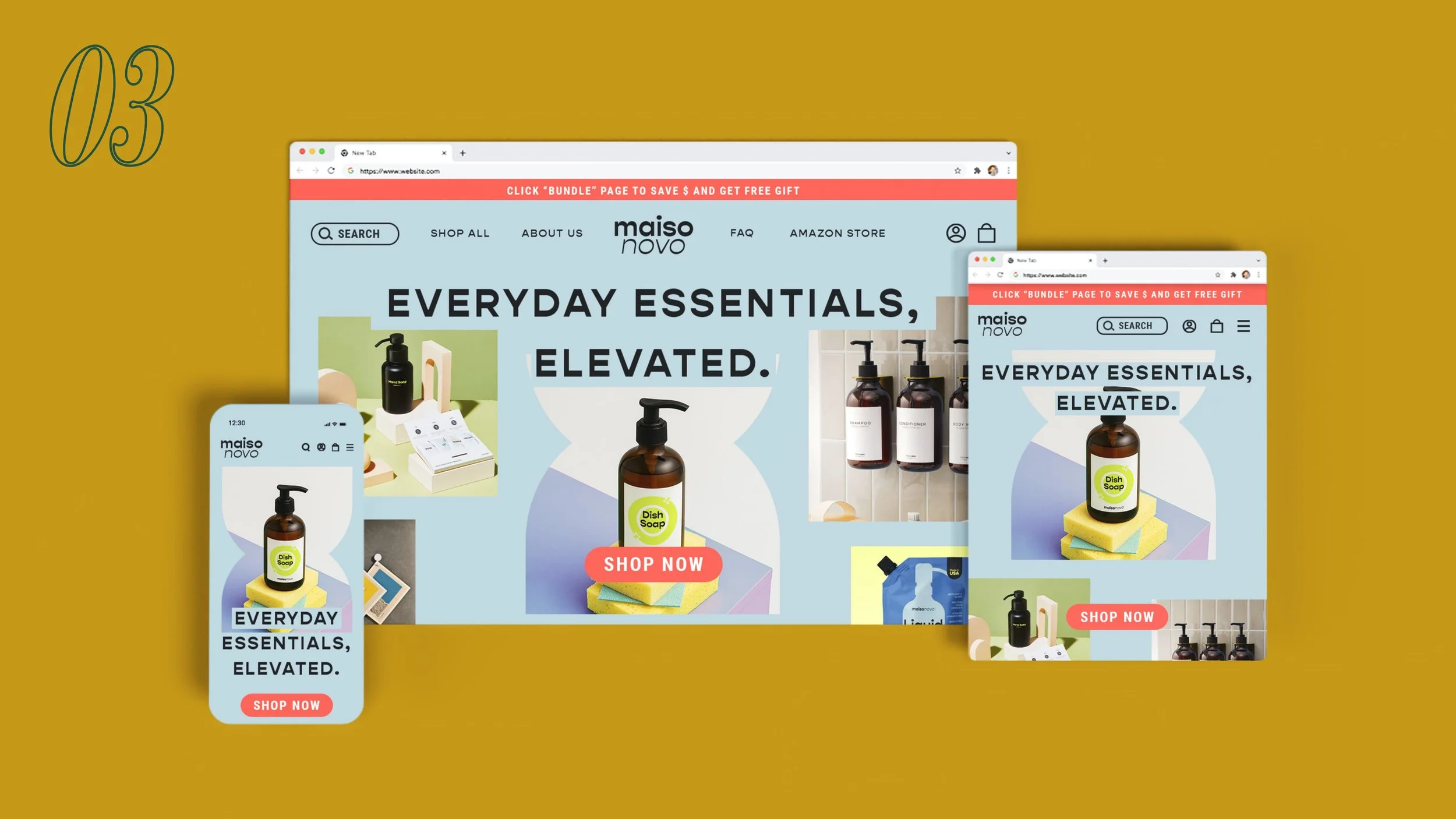
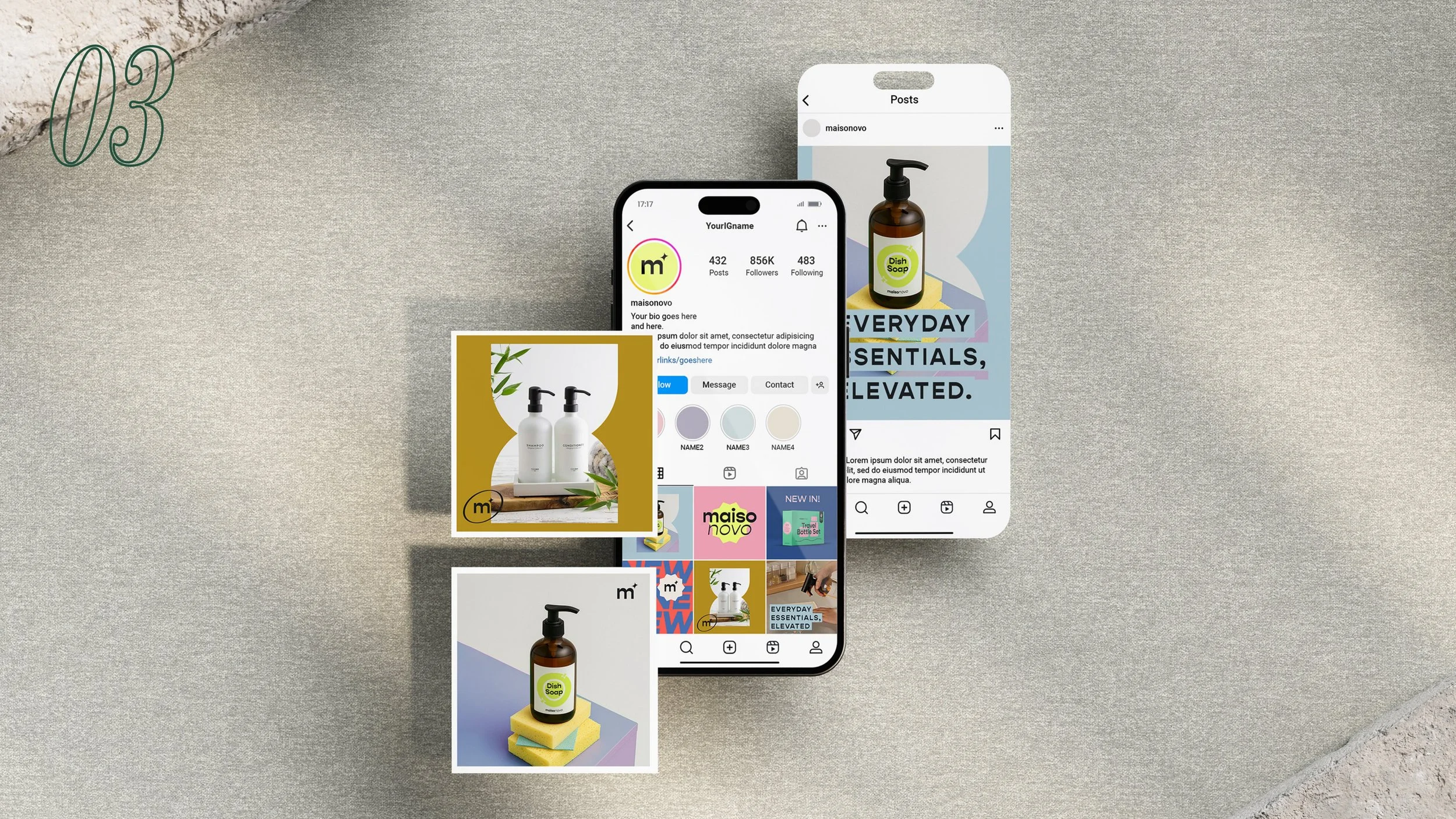
The third direction is the most universal. A rounded sans-serif logotype — clean, friendly, approachable — paired with a warm, light blue base and strategic color blocking. The icon system (an "m" with a spark) keeps things fresh without being loud. This is a brand that says "everyday essentials, elevated" without needing to explain itself.
It's the direction most aligned with all three archetypes simultaneously: efficient and clear, without being cold. The website mockups show how much personality a restrained palette can carry when the layout and typography do the work.
Clean Utility — Modern Simplicity
What This Project Was Really About
Rebranding an established brand is a different challenge than building one from scratch. The hardest part isn't generating new ideas — it's knowing what to protect. These three directions each answer the brief differently, but they share the same starting point: a brand with real values, and an audience worth earning.
Selected works in this portfolio were created for W4 Management and Maisonovo. All rights belong to them and are shown here for showcase purposes only.