

Teafacto — Rebranding
Reimagining a traditional herbal tea brand to connect with Gen Z audiences and improve e-commerce performance.
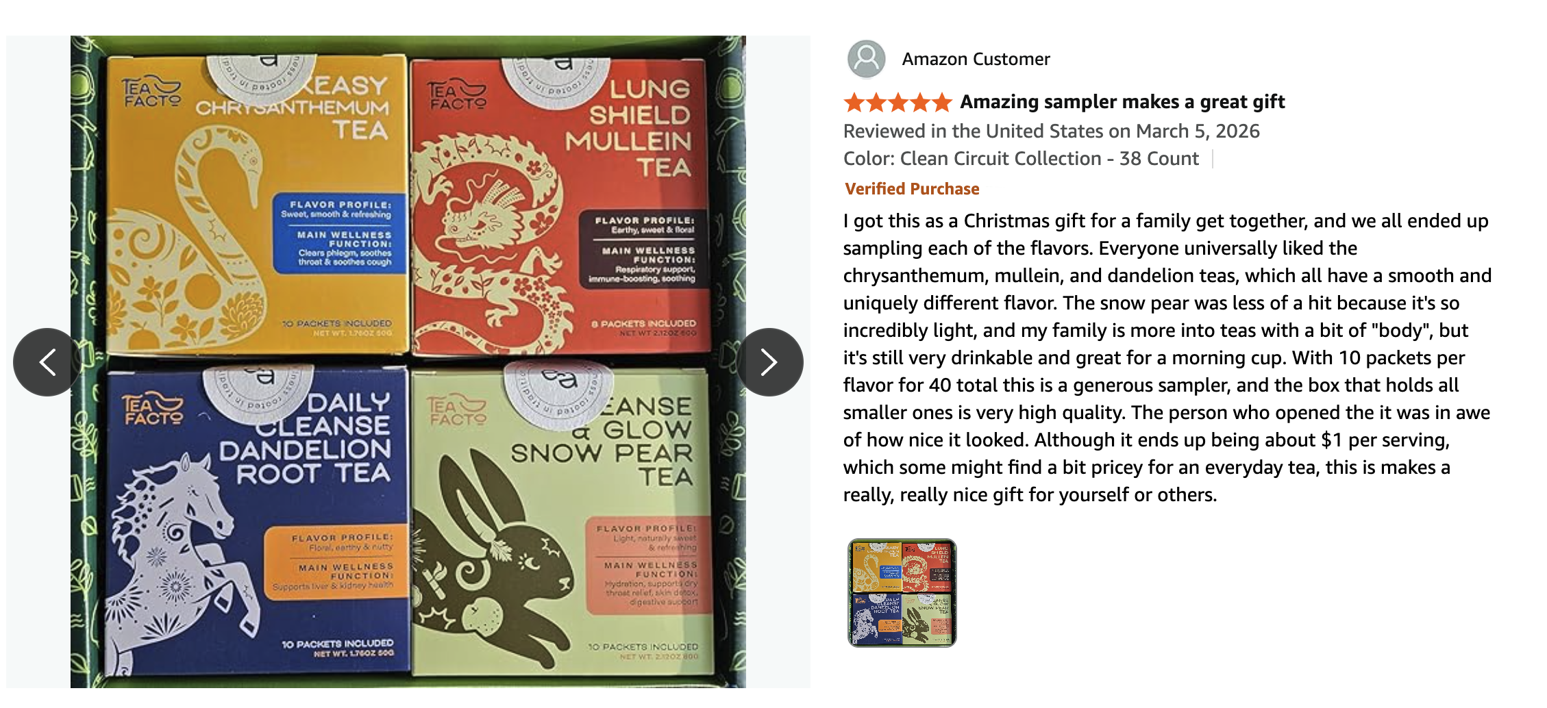
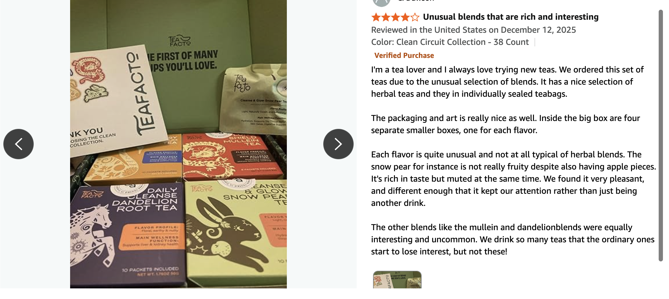
⭐ ↑ Amazon rating increased from 4.3 to 4.7
Art Direction
✳︎
Branding
✳︎
Packaging & Print
✳︎
UI Design
✳︎
AI Generated Graphics
✳︎
Art Direction ✳︎ Branding ✳︎ Packaging & Print ✳︎ UI Design ✳︎ AI Generated Graphics ✳︎
Quick Overview
Context
US-based herbal tea brand with Chinese roots, bringing traditional remedies to a modern audience.
Outdated branding, low differentiation, and weak connection with younger audiences.
Challenge
The brand lacked a strong visual identity and struggled to stand out in a saturated Amazon marketplace.
The Problem
Insight
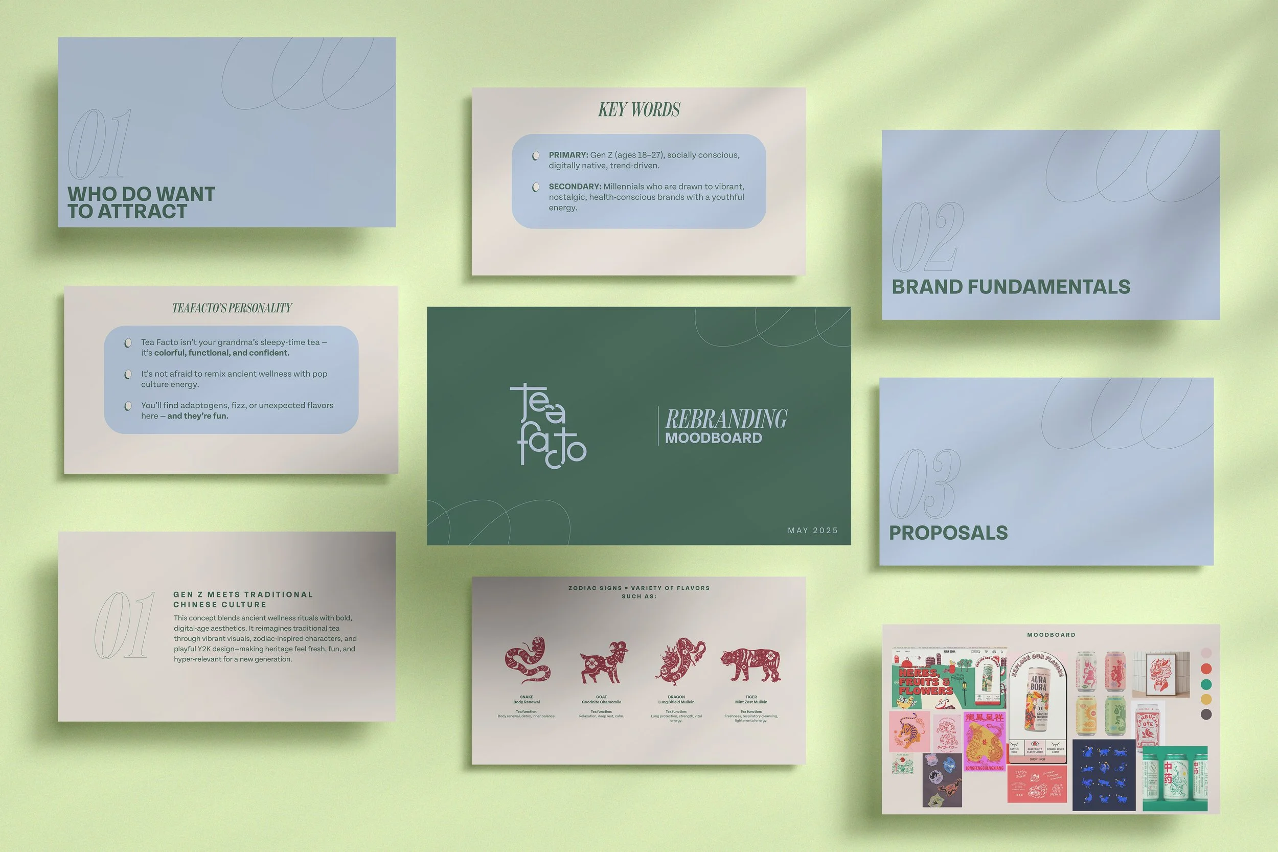
For this project, I built on Tea Facto’s existing target research and expanded it by exploring insights from the audience they aimed to attract—Gen Z consumers in their 20s. The goal was to reposition the brand with a more current and culturally relevant visual language.
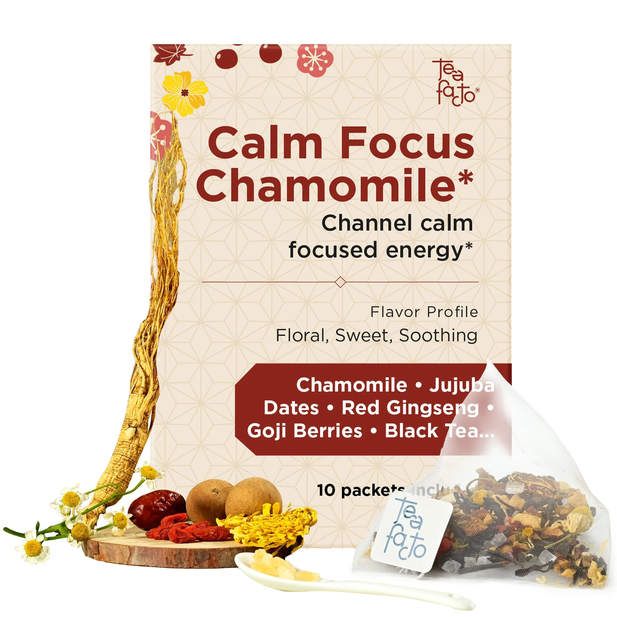
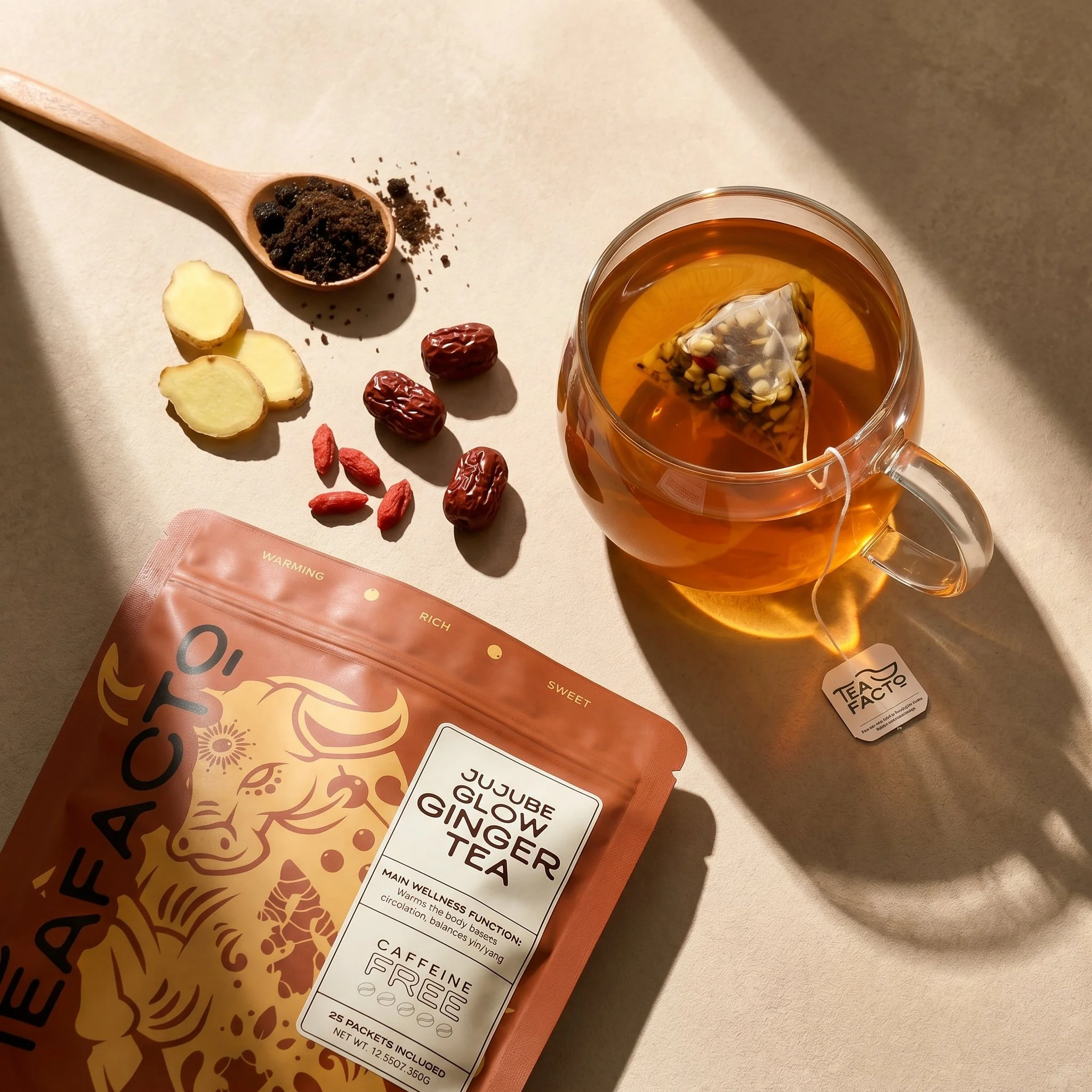
The visual direction focused on a brighter color palette and more organic illustration styles to create a fresher, more approachable feel.
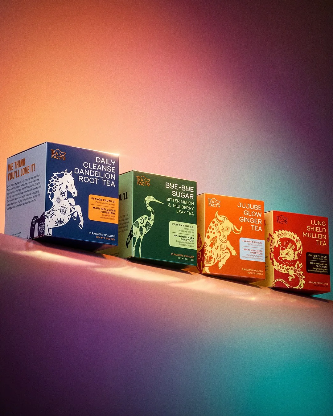
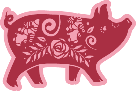
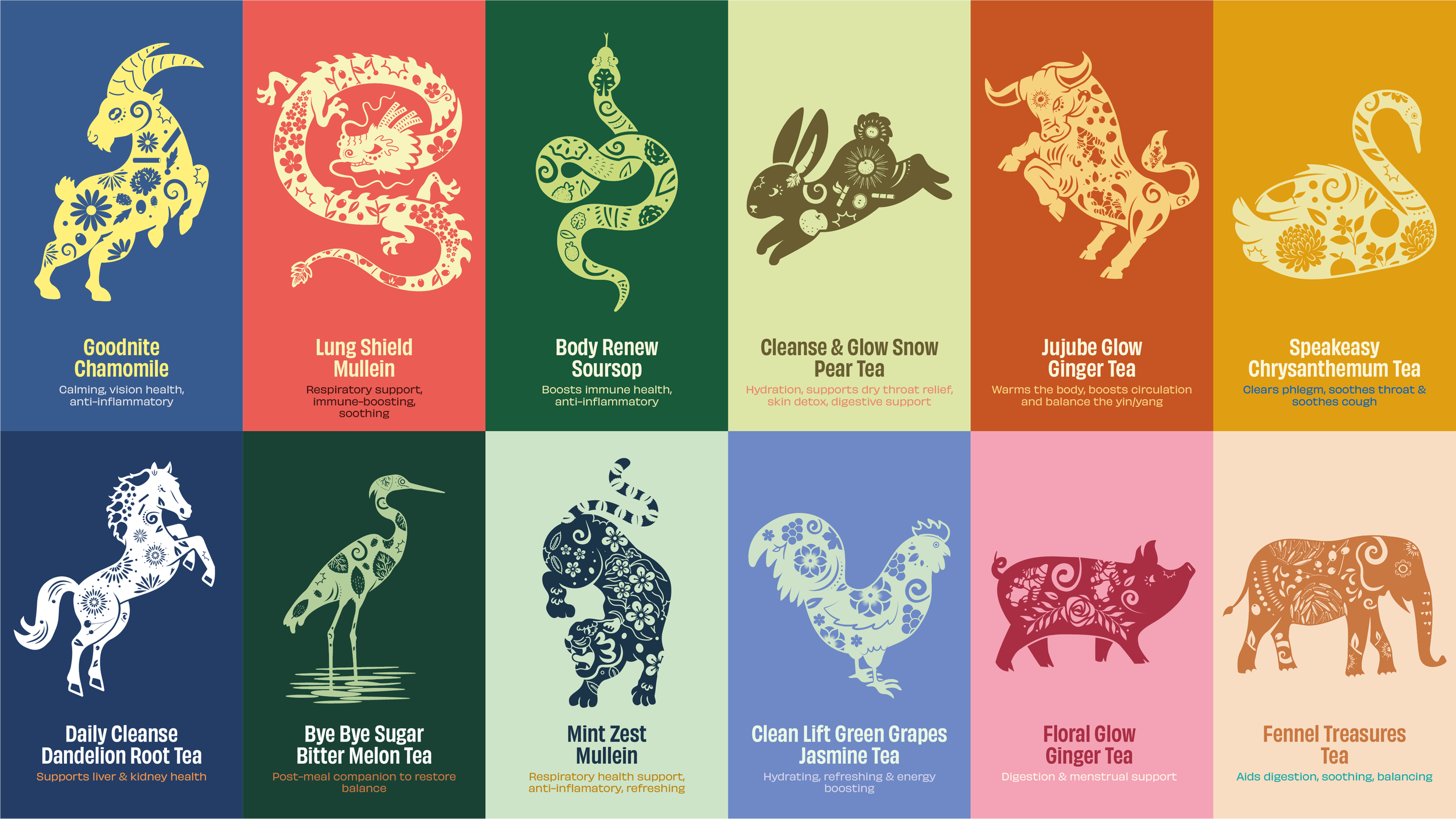
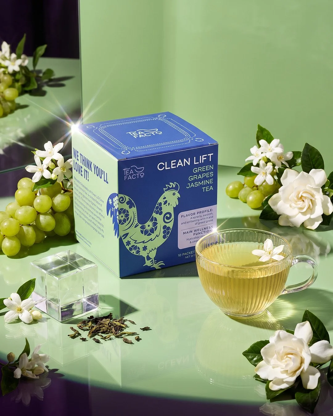
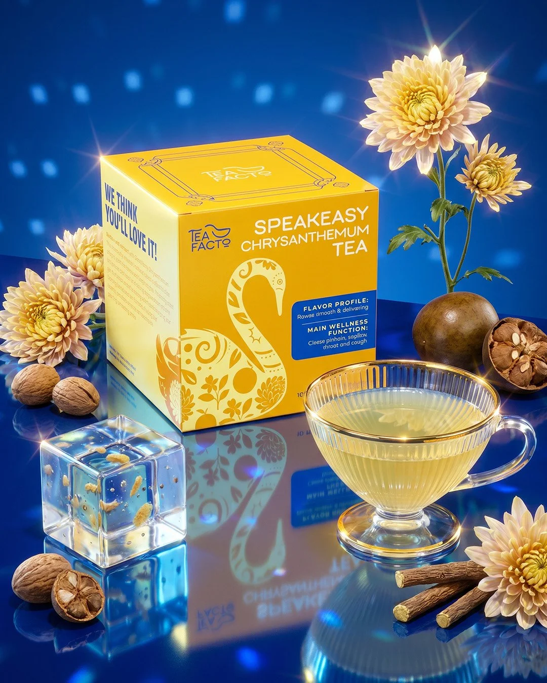
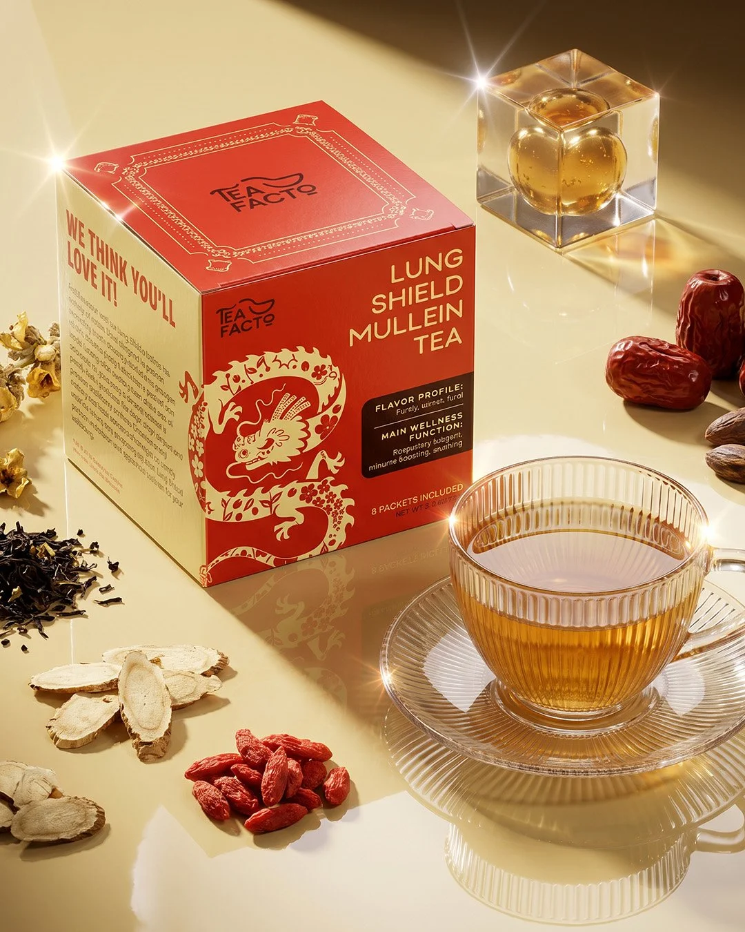
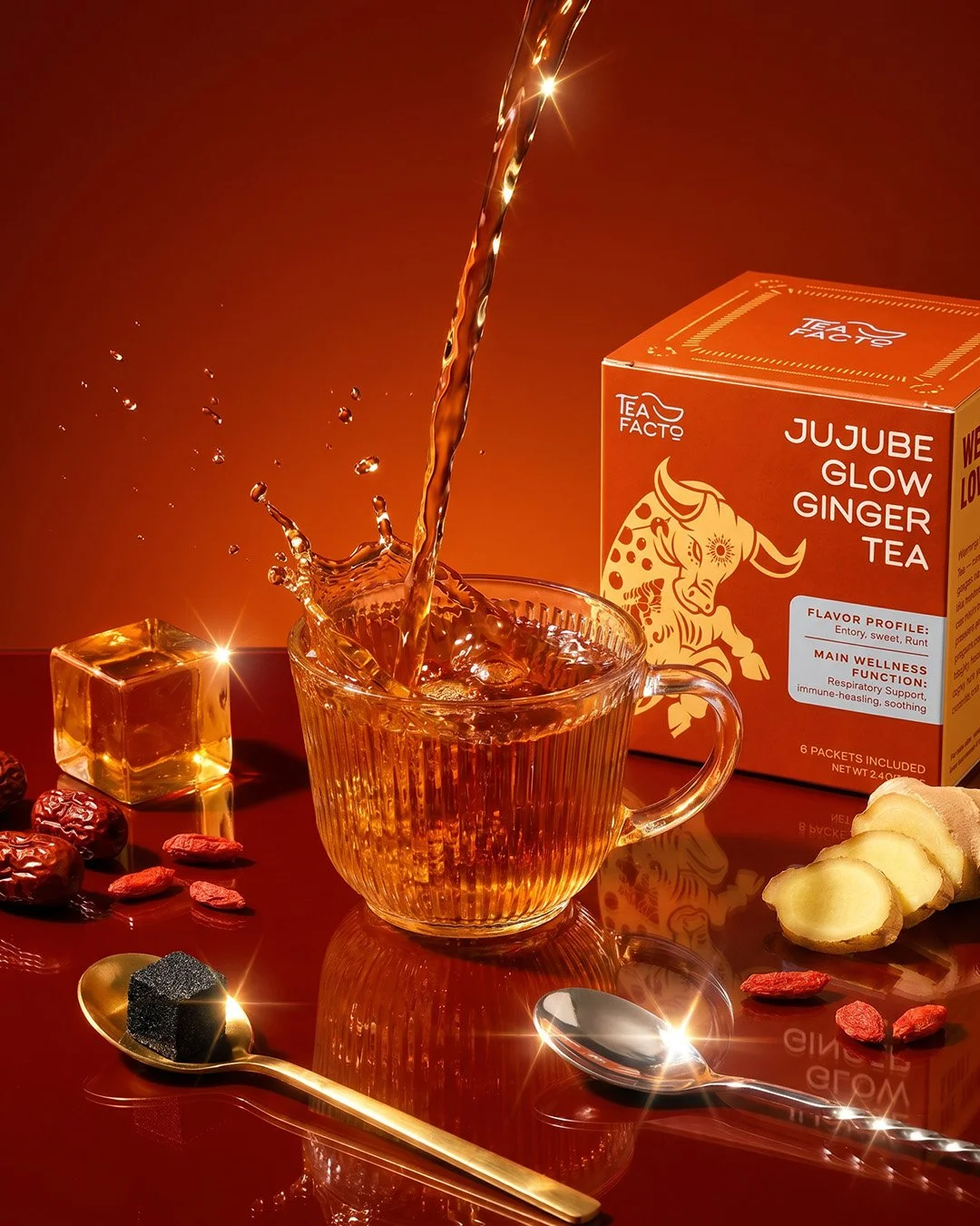
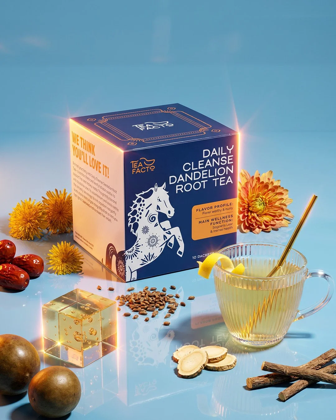
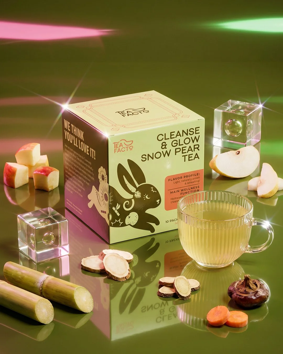
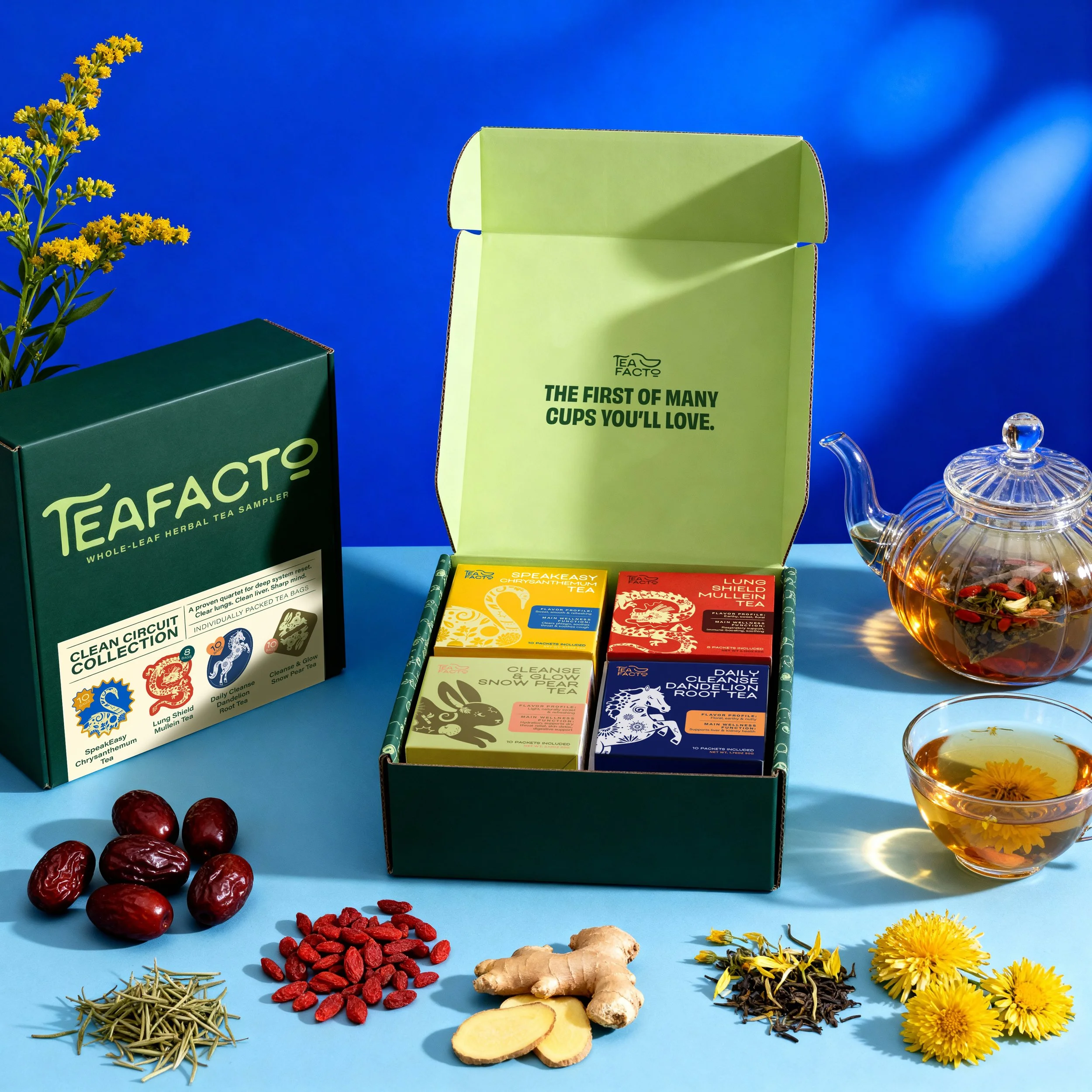
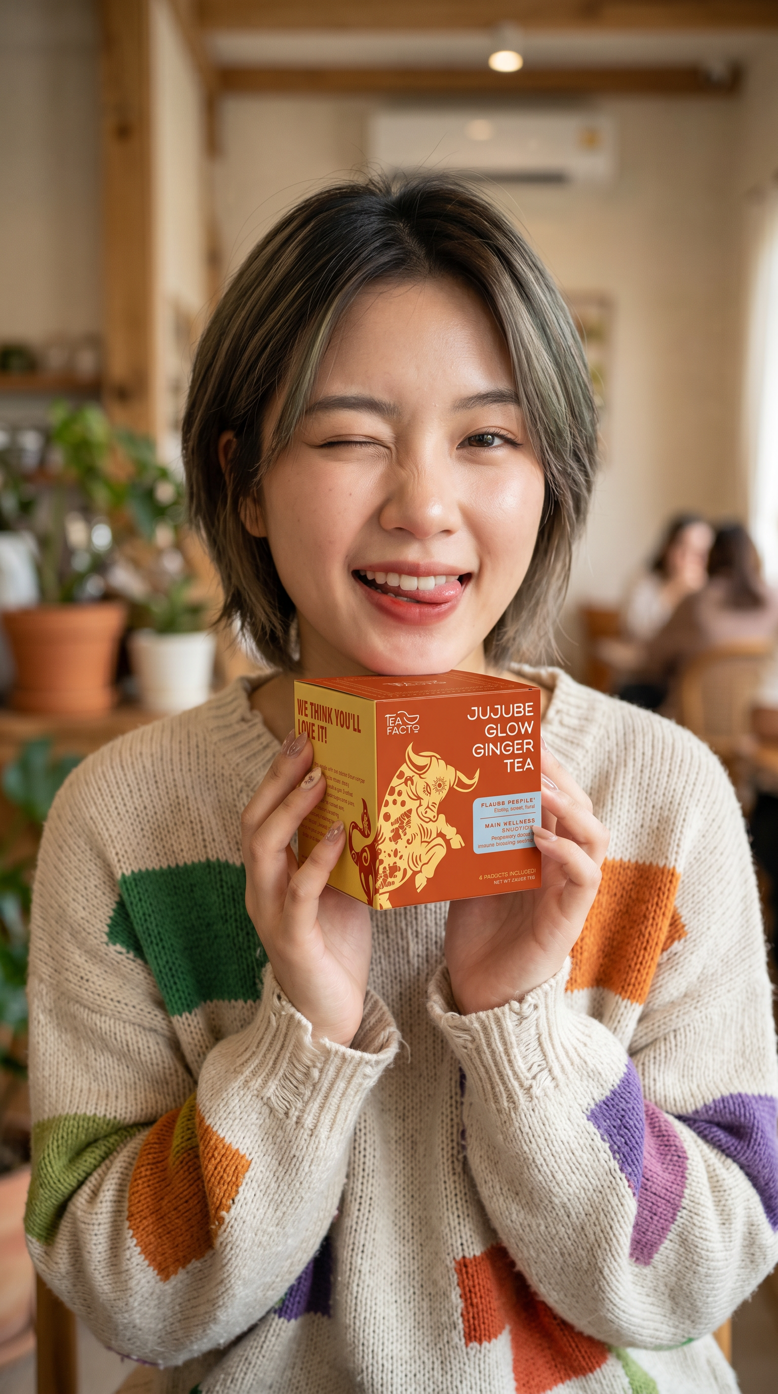
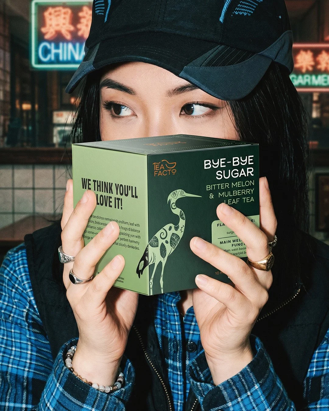
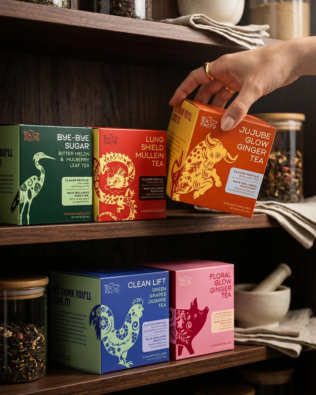
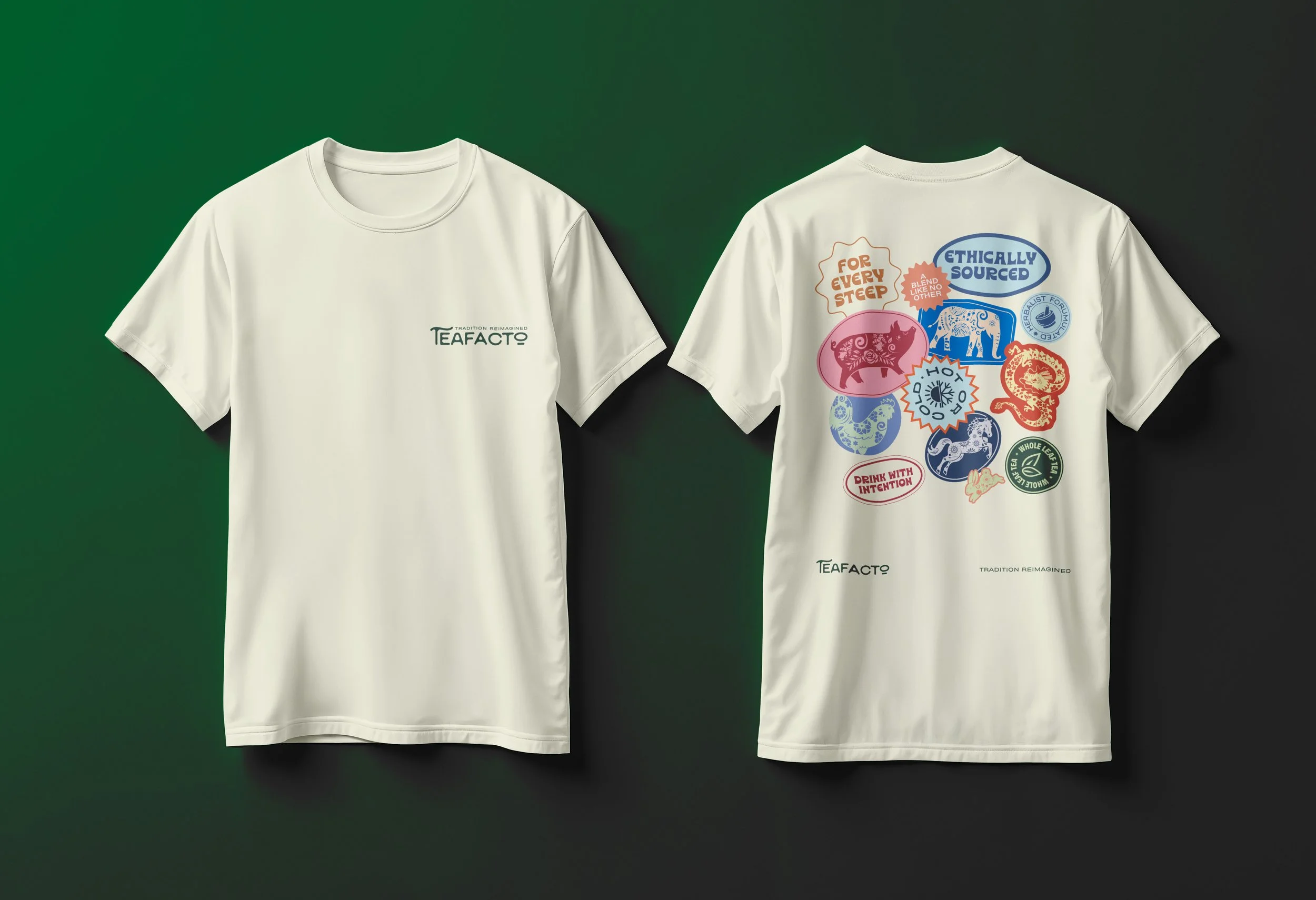
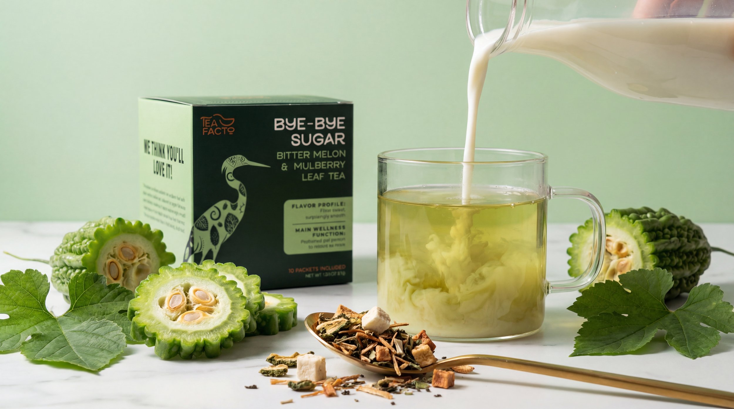
I drew inspiration from traditional Chinese paper-cut art to develop the animal illustrations. Each animal was intentionally selected to reflect the flavor it represents, going beyond the Chinese zodiac to include broader cultural associations within Chinese symbolism.


Concept
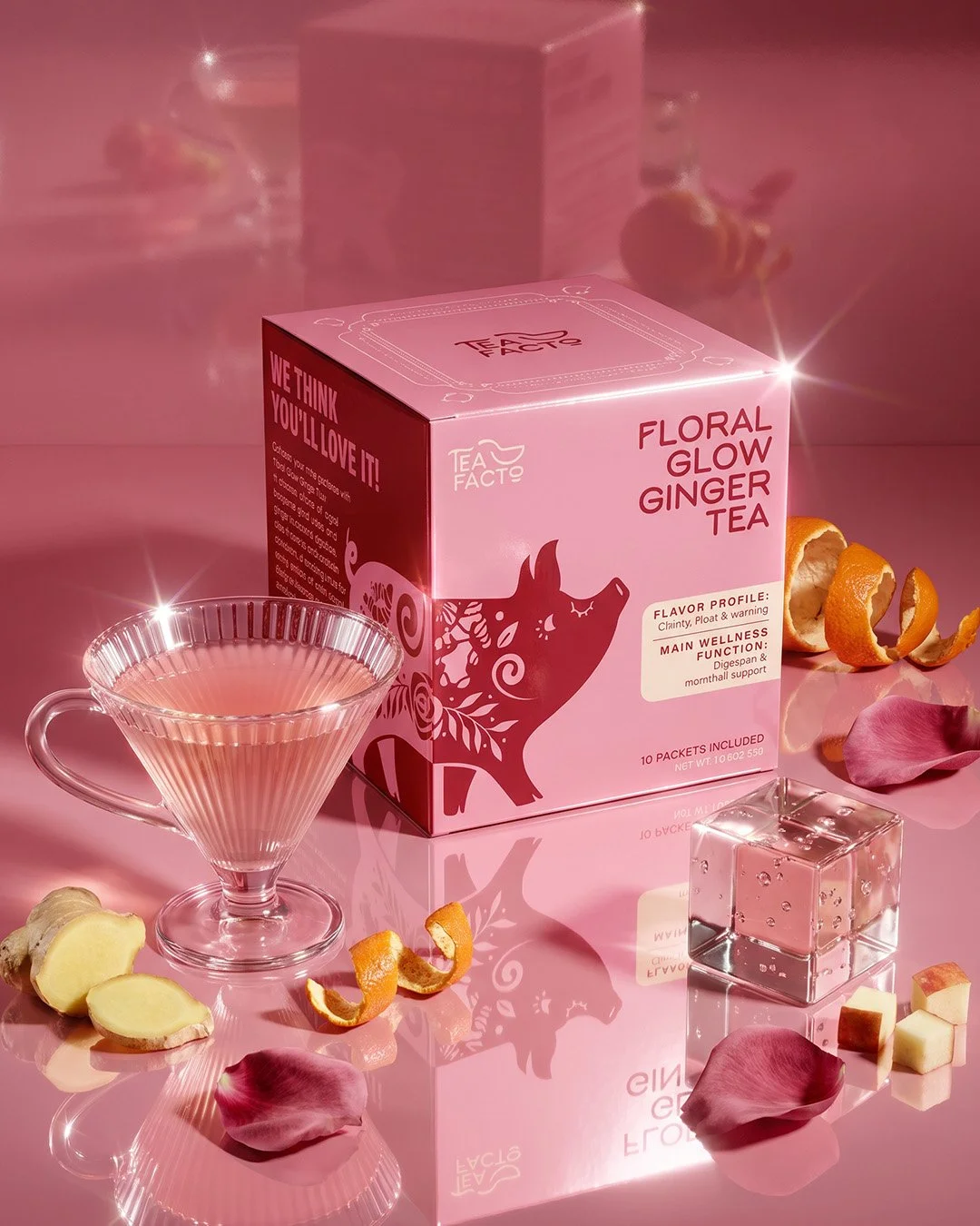
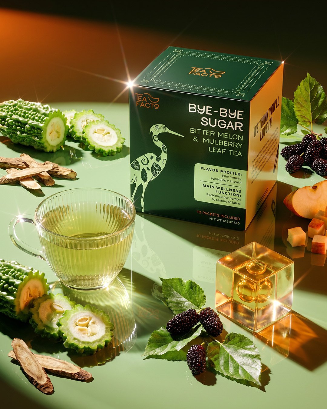
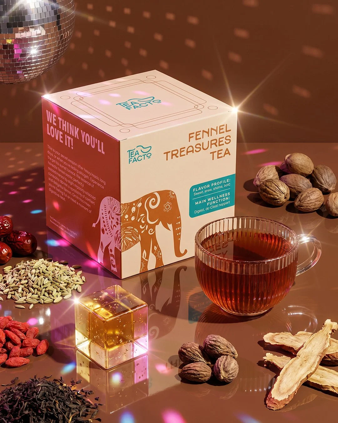
A curated system of animals drawn from Chinese cultural symbolism — primarily the zodiac, expanded where the zodiac fell short. When a zodiac animal didn't carry the right meaning for a blend, I looked further: the elephant for strength and resilience, the swan for elegance and throat relief — its long, graceful neck a visual metaphor for the tea's benefit.
Every pairing was earned. No animal made it in without a reason.
Gen Z Meets Traditional Chinese Culture


Design System
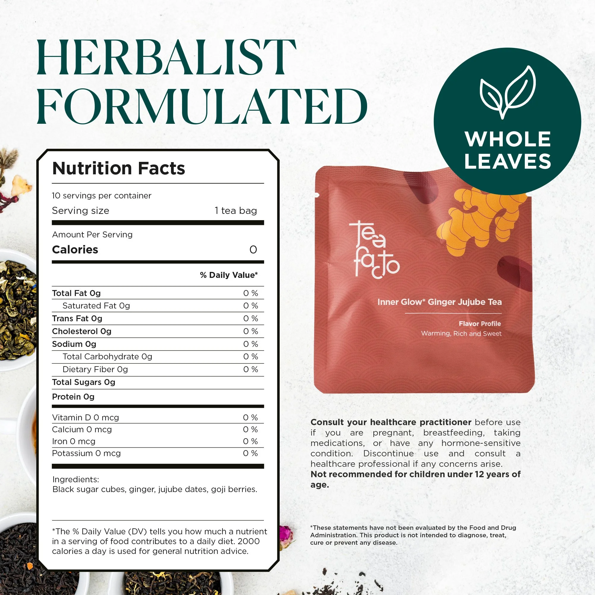
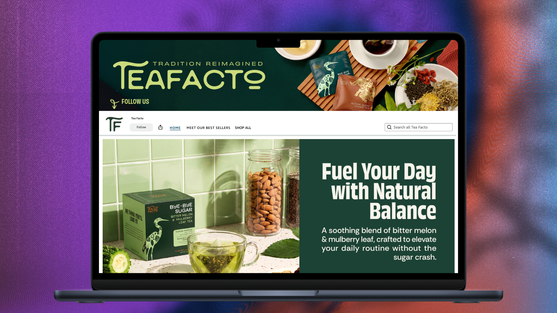
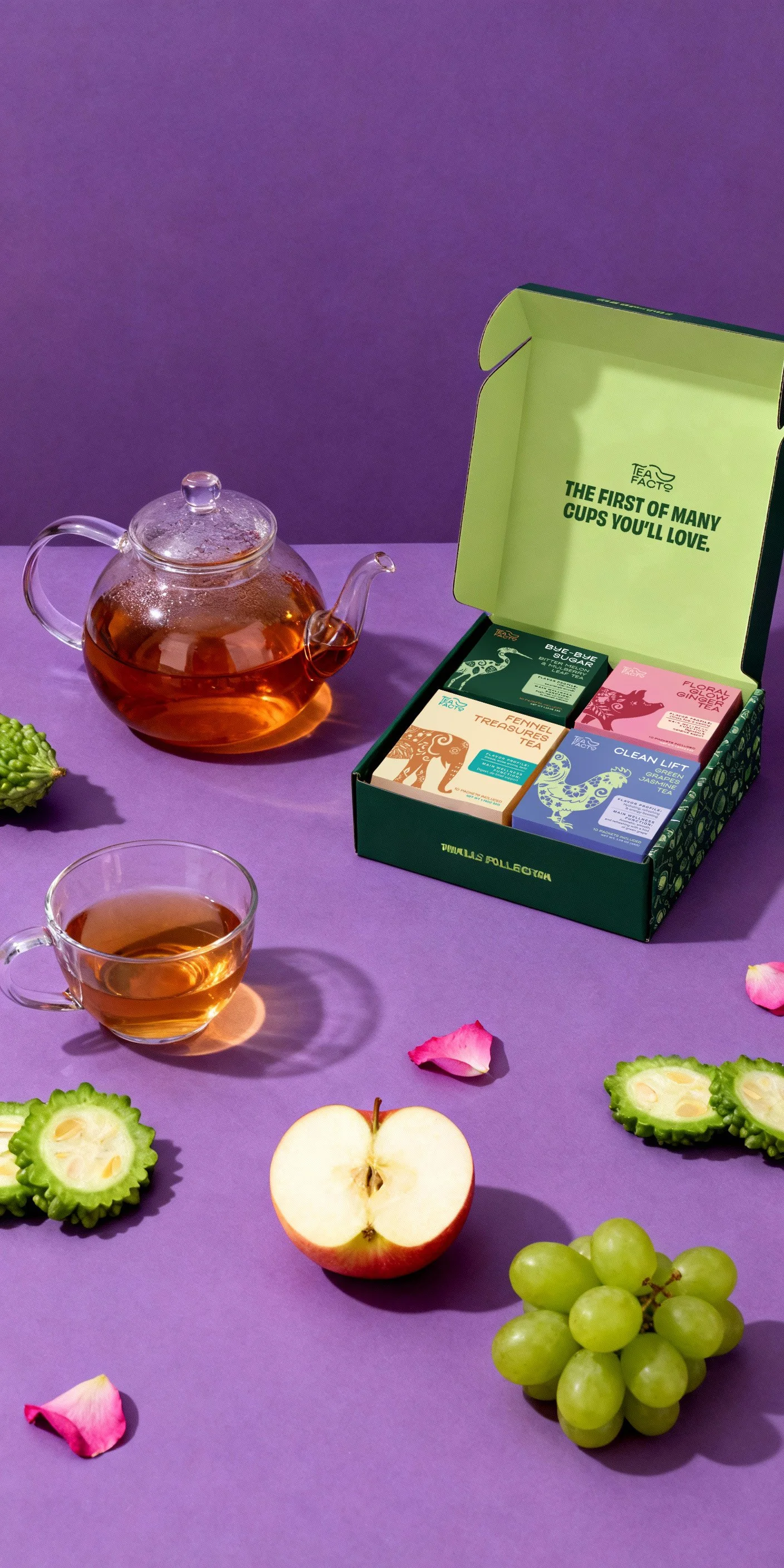
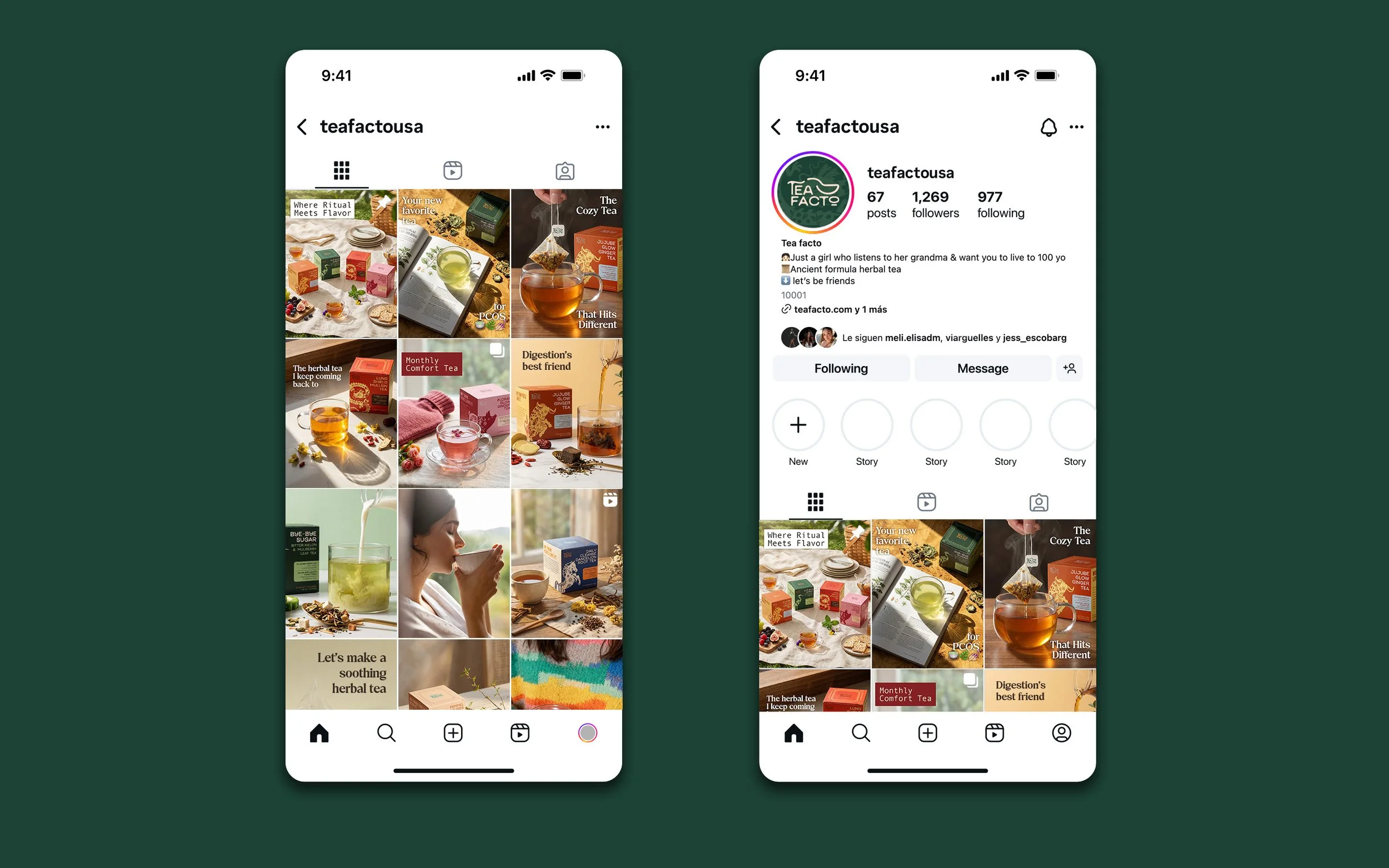
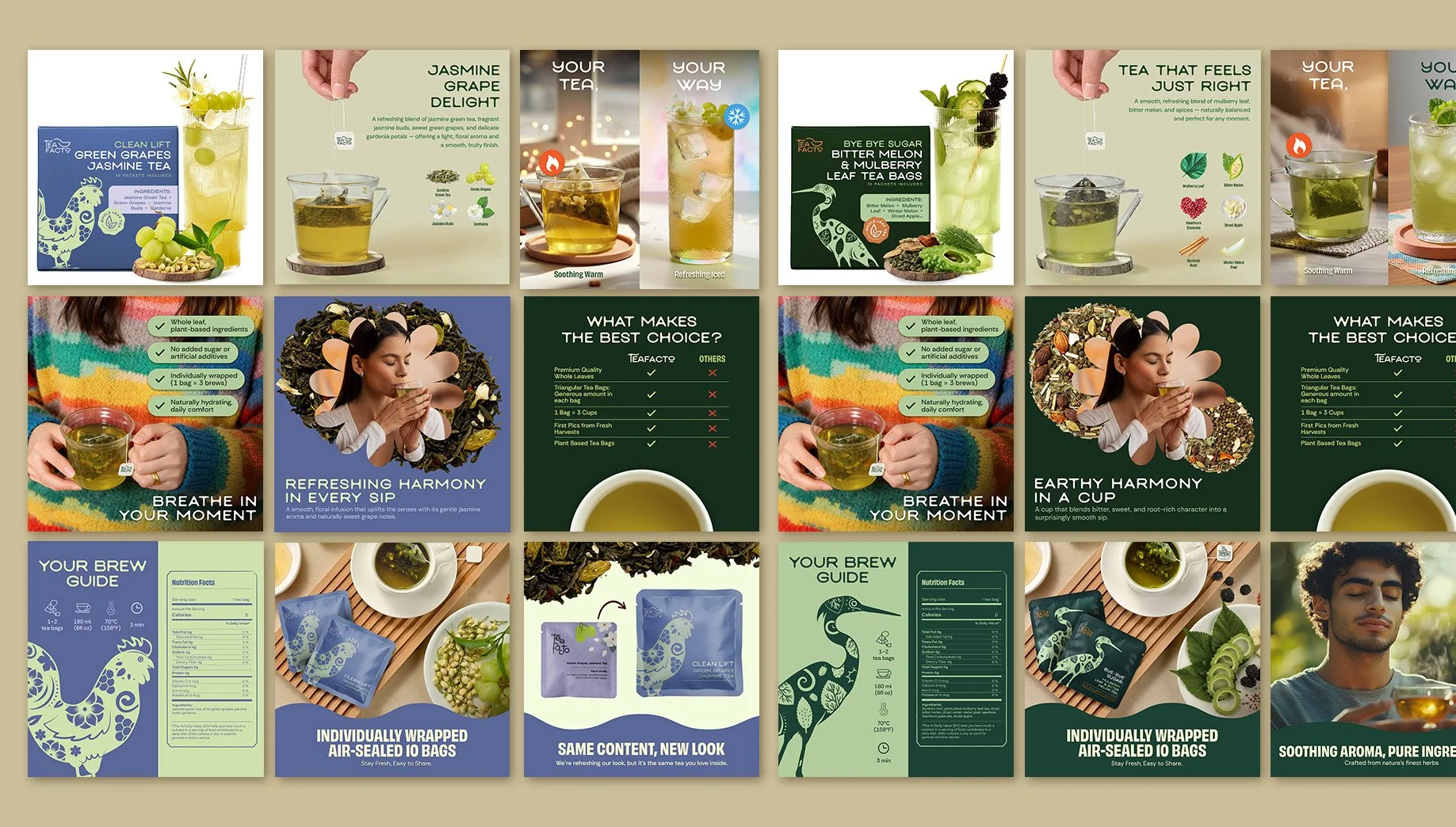
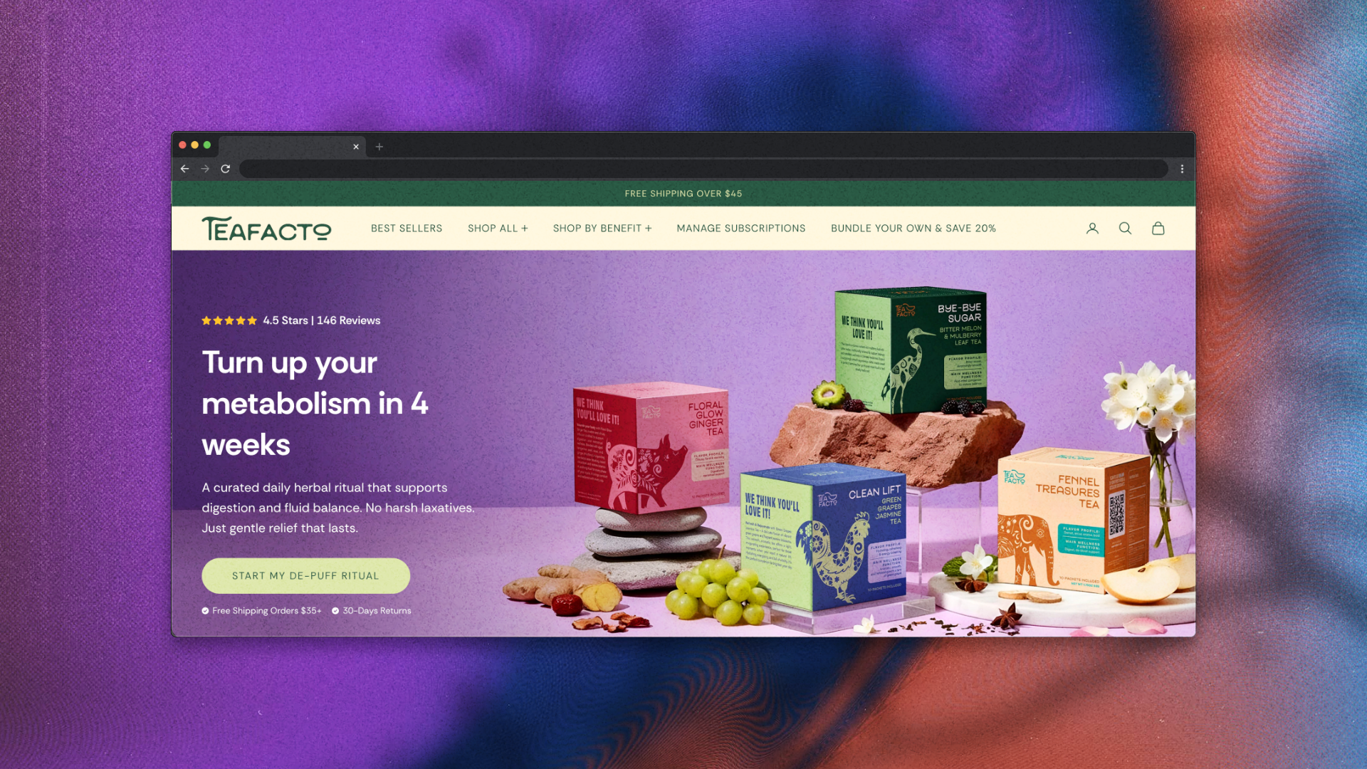
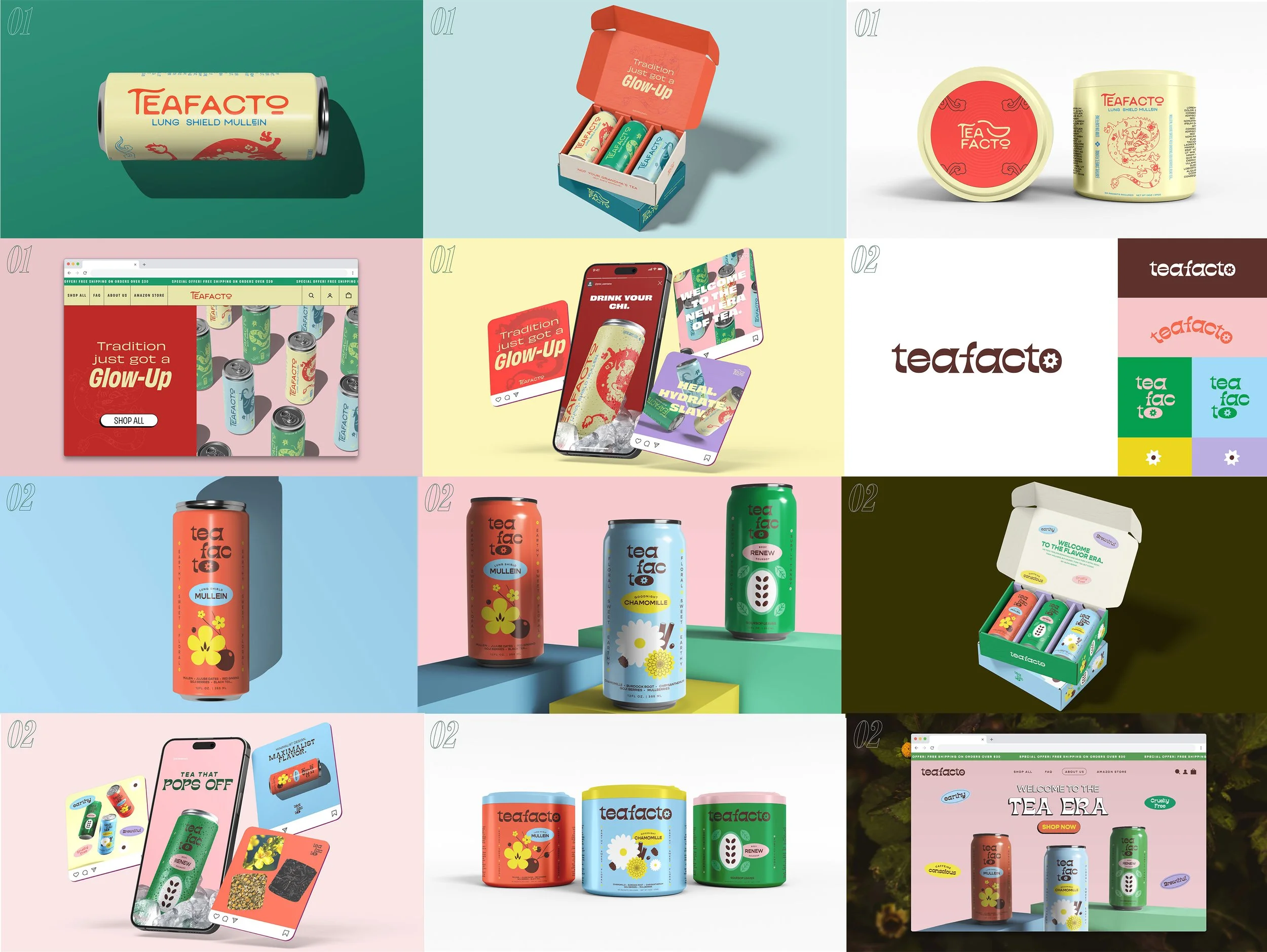
The visual identity was built to work hard across every format: packaging, e-commerce listings, print, and social. Custom illustrations for each animal were conceptualized individually, ensuring that the cultural connection felt considered — not generic.
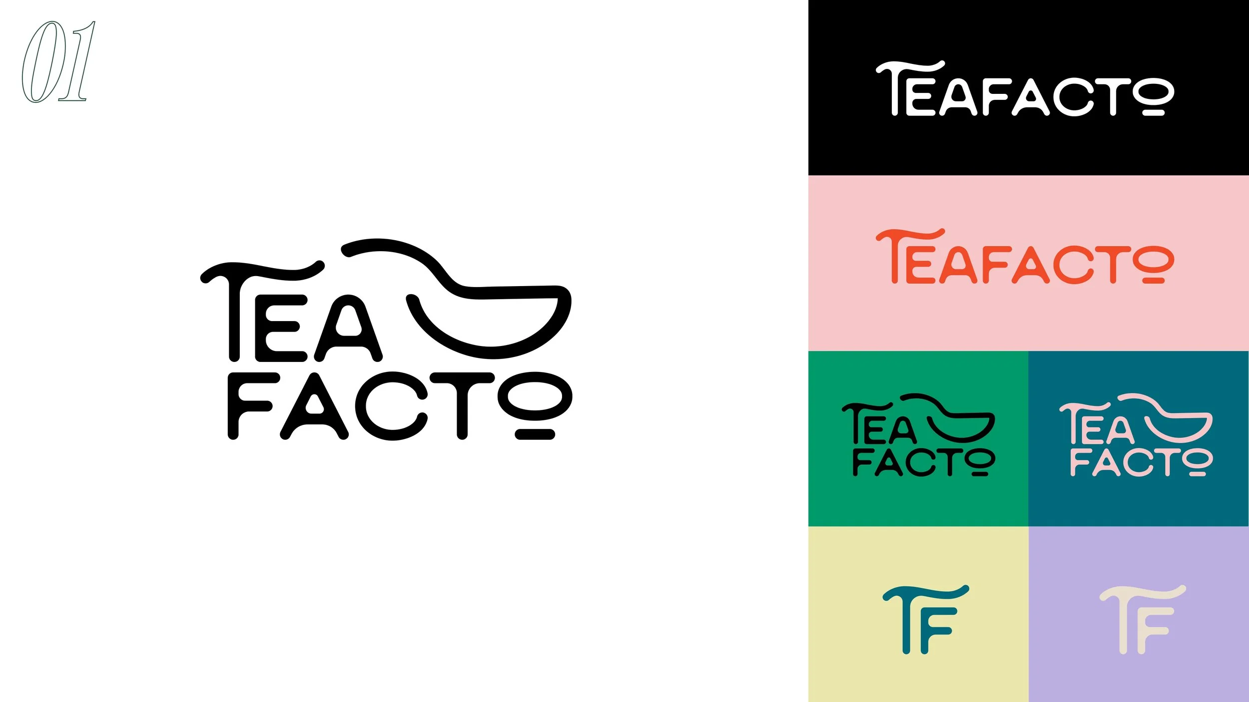
Logo
The Teafacto logo was designed as a flexible system — a vertical lockup for packaging and print, a horizontal version for digital environments and storefronts — built to maintain presence and legibility across every customer touchpoint.
The wordmark uses the same organic letterforms as the brand's headline typography, reinforcing the handcrafted nature of the product at the most fundamental level of identity. If the brand's promise is that these teas are made with care and tradition, the logo had to feel like it was drawn, not engineered.
The icon is a single continuous stroke — an abstract form that suggests both a teacup and the act of pouring. The fluidity is intentional: in a product line where every blend serves a different health or wellness benefit, the mark needed to feel alive and in motion, not static. It's a brand with range, and the logo leaves room for that.
Typography
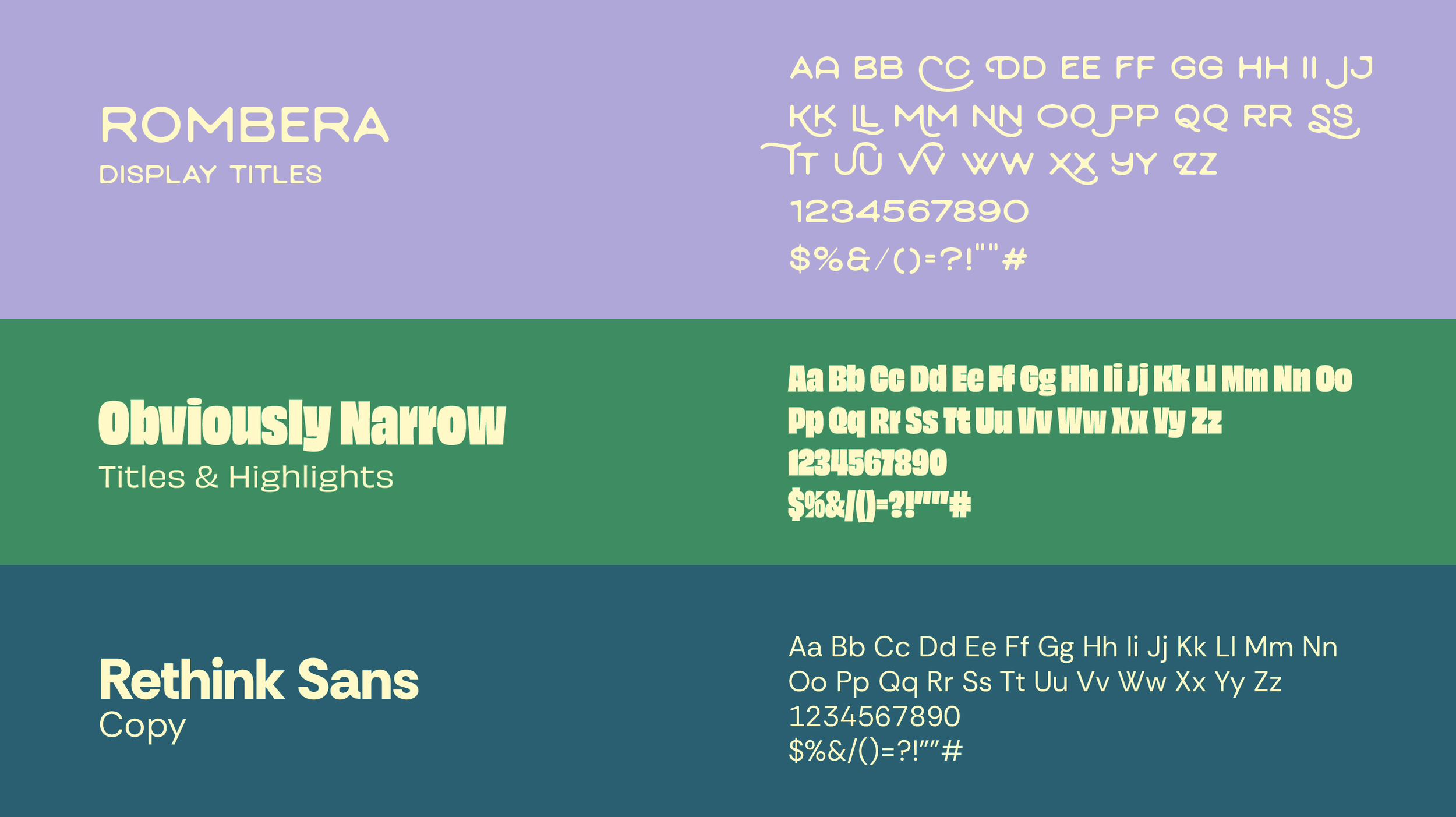
Typography
Three typefaces, three roles.
Rombera leads the headlines — organic letterforms that signal handcrafted without saying it. Expressive enough to stop the scroll, grounded enough to feel trustworthy.
Obviously handles high-impact moments in social and e-commerce. A grotesque with variable axis, it reads fast at any size — from packaging to a story frame — and adapts across weights without losing presence.
Rethink Sans covers body copy. Rounded and legible at small sizes, it keeps the brand accessible across digital formats without competing with the other two.
Three registers — expressive, impactful, legible — one coherent system.
Color
Rather than a single brand palette, the color system was built as a flavor architecture — each blend assigned its own trio of colors, selected at the intersection of three frameworks: color psychology, traditional Chinese color symbolism, and the visual language of the ingredients themselves.
Red signals protection and vitality — rooted in both Western urgency and Chinese cultural meaning around strength and good fortune. Purple is reserved for blends associated with calm and relaxation, a color long tied to rest and introspection across cultures. Every pairing was deliberate: the color had to earn its place on three levels before it made it into the system.
The result is a palette that scales — each product feels distinct, but the underlying logic keeps the full line coherent.
Application
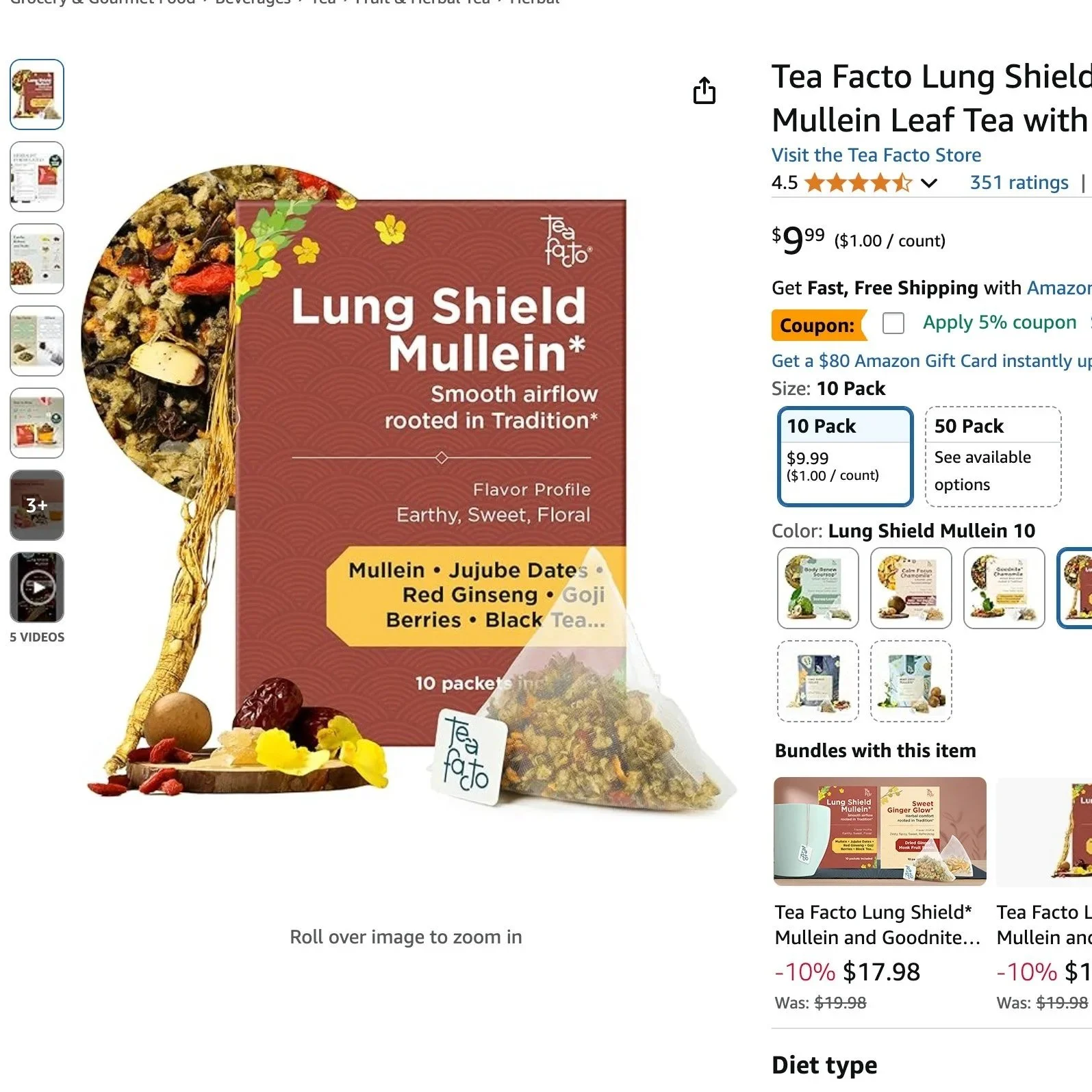
The new brand system was applied across every customer touchpoint: Amazon product listings, storefront redesign, social media content, website, and print display materials for US trade shows. AI-assisted content generation was used for digital assets to ensure scale without sacrificing visual consistency.
Process
The initial brief pointed in a different direction entirely. The client was exploring a canned tea line — think Olipop — with a vintage American aesthetic. The visual direction was loosely defined, and the cultural identity of the brand was being set aside in favor of trend alignment.
The problem wasn't the aesthetic. It was the strategy. A vintage American look might work for a brand built in America. But Teafacto's entire value proposition — the reason someone chooses it over the dozens of wellness teas already on Amazon — is that it carries genuine Chinese heritage and traditional knowledge. Erasing that to chase a trend would have made the brand invisible, not relevant.
I redirected the conversation toward the audience: who is actually buying herbal teas on Amazon, and what do they find compelling about Eastern wellness traditions? That research reframed the brief. The result wasn't a tea brand that looked Gen Z. It was a brand that spoke Gen Z's language while staying rooted in something no competitor could copy.
Selected works in this portfolio were created for W4 Management and Teafacto. All rights belong to them and are shown here for showcase purposes only.Results
Since the rebrand launched in July 2025, Teafacto's Amazon score has climbed from 4.3 to 4.7 — with customers specifically commenting on the visual identity in their reviews. That's rare. It means the design isn't just prettier. It's doing persuasive work.